Stress on Symbolic Form in Tonalism
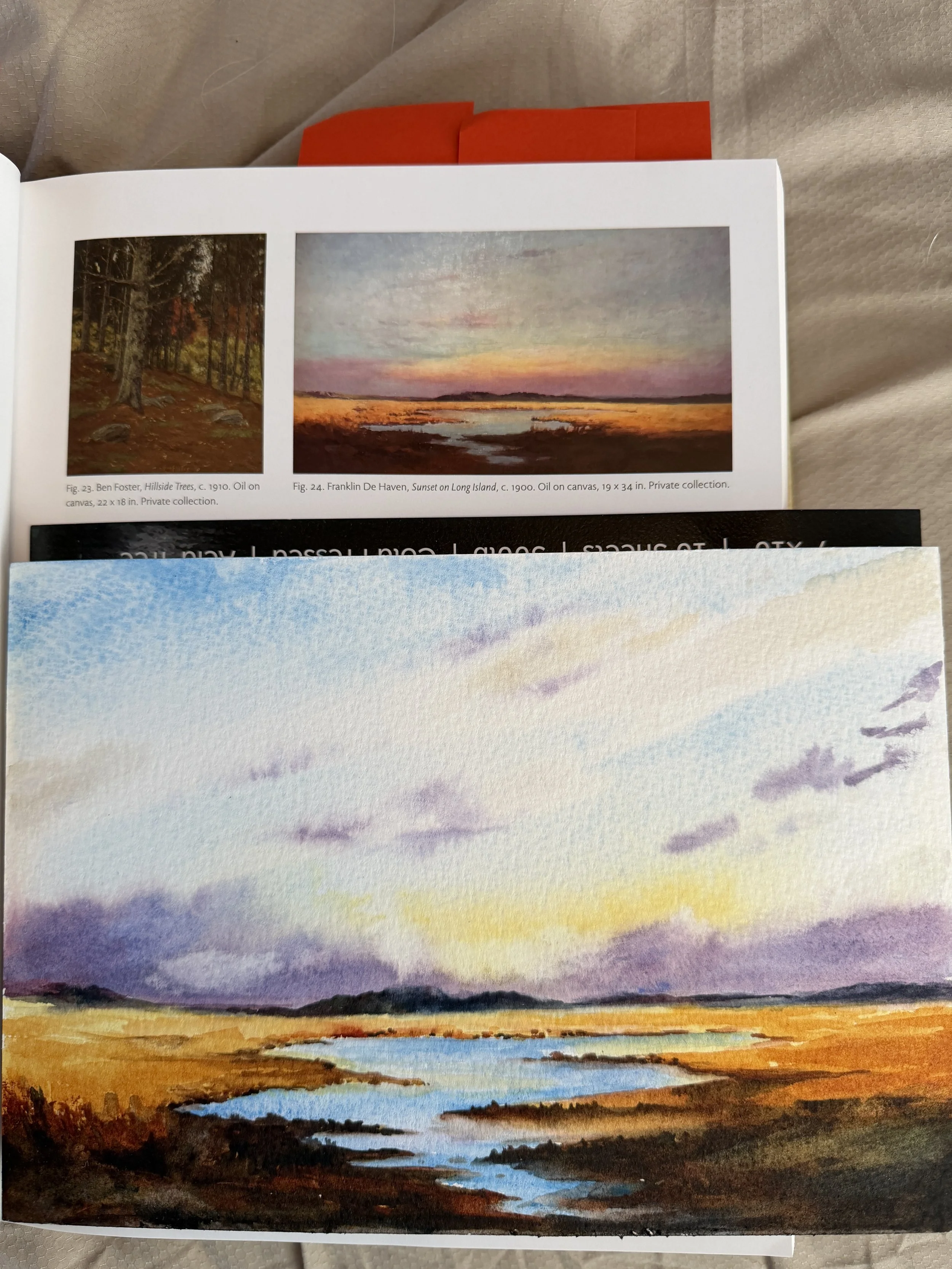
According to the History of American Tonalism, the Tonalist use of a narrow range of tones and the synthetic arrangement of landscape elements adds to the immediacy of the composition, strengthening the graphic read of organic, geologic, and manmade features, and thus the symbolic impact of natural forms, whether in stark silhouette or set against a neutral background. Often you see a grouping of trees set against a bright or neutral background, but it really can be anything, like the sails in the last two studies. This symbolic form is without detail but you KNOW what it is. For this study, I have chosen to start with Franklin De Haven’s Sunset on Long Island, c. 1900. I chose this painting because this looks like a watercolor, even though it was not originally. Let’s see how I do.
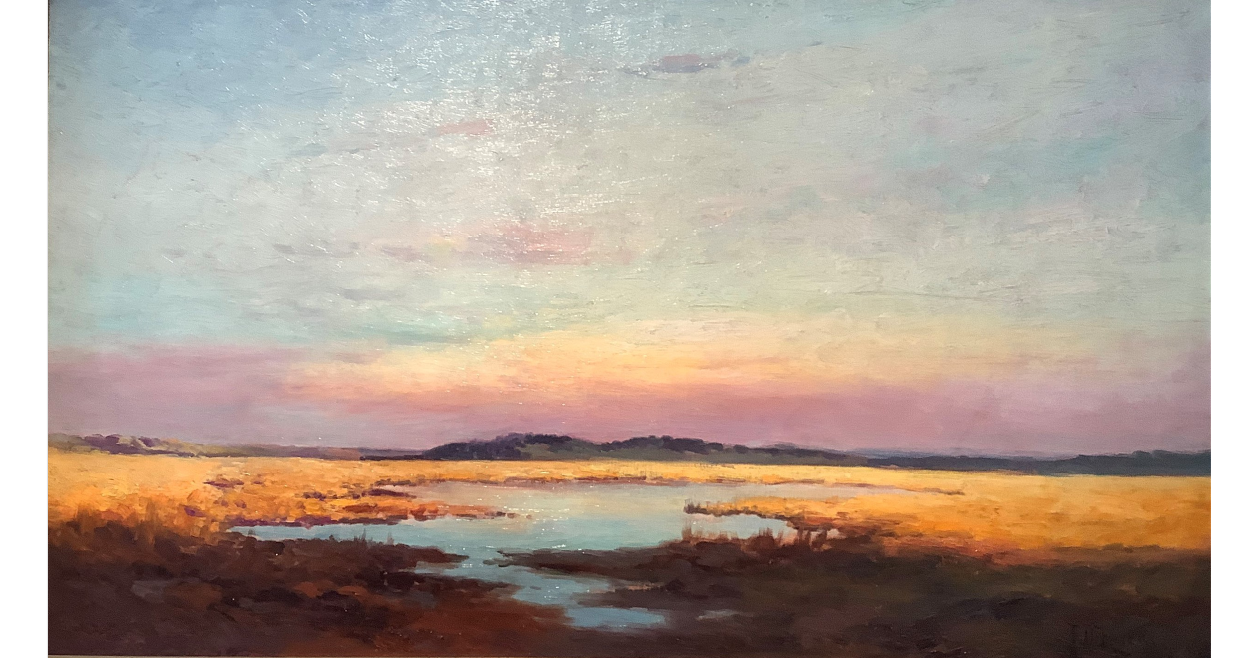
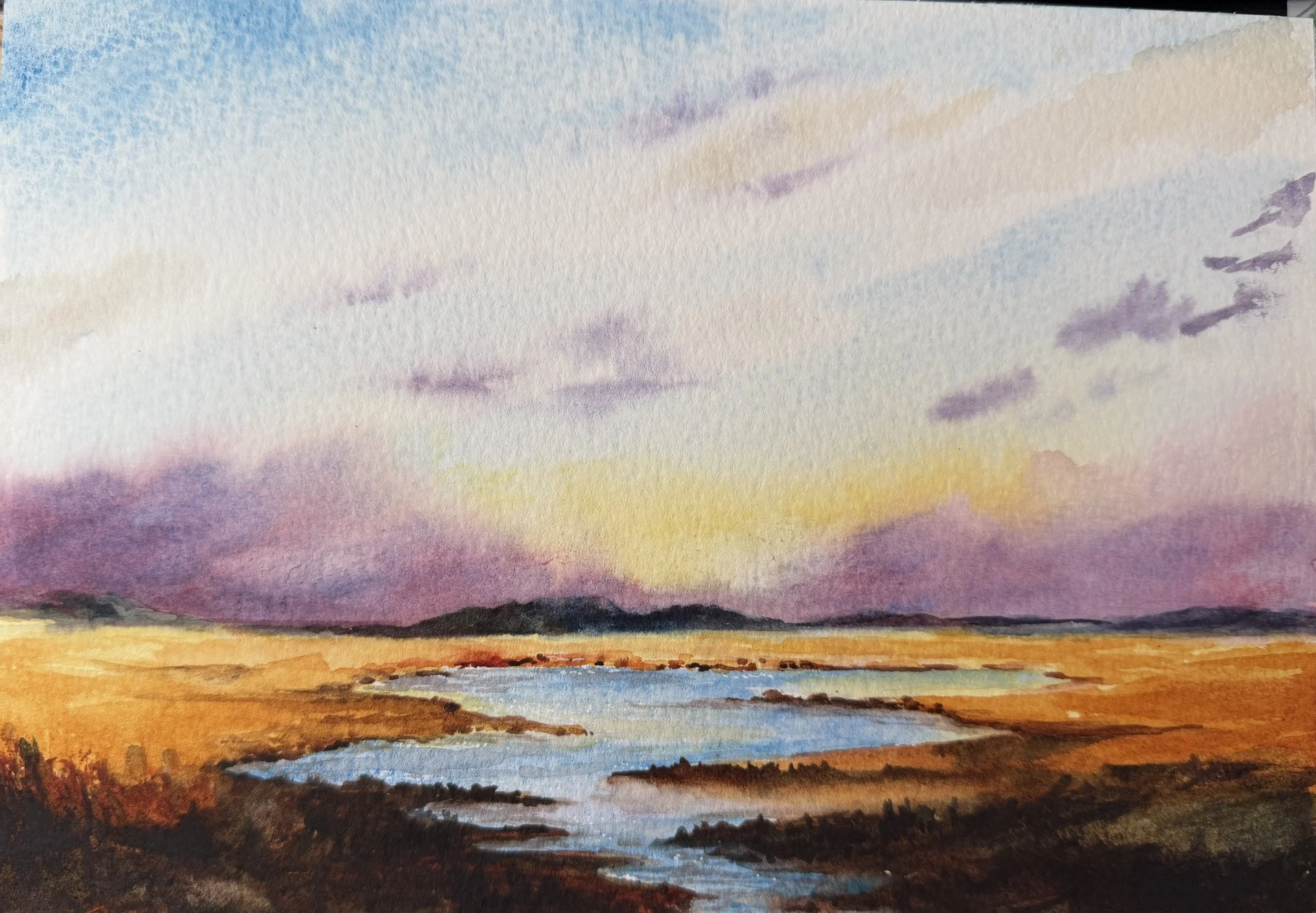
The original (above) is just so stunning! Buttery blended goodness all around. The symbolic for is in the plains of color, the massive sky meeting with the narrow slip of trees in the horizon, giving way to the golden vastness of the marsh grass with a bit of water thrown in so you know you are looking at something coastal.
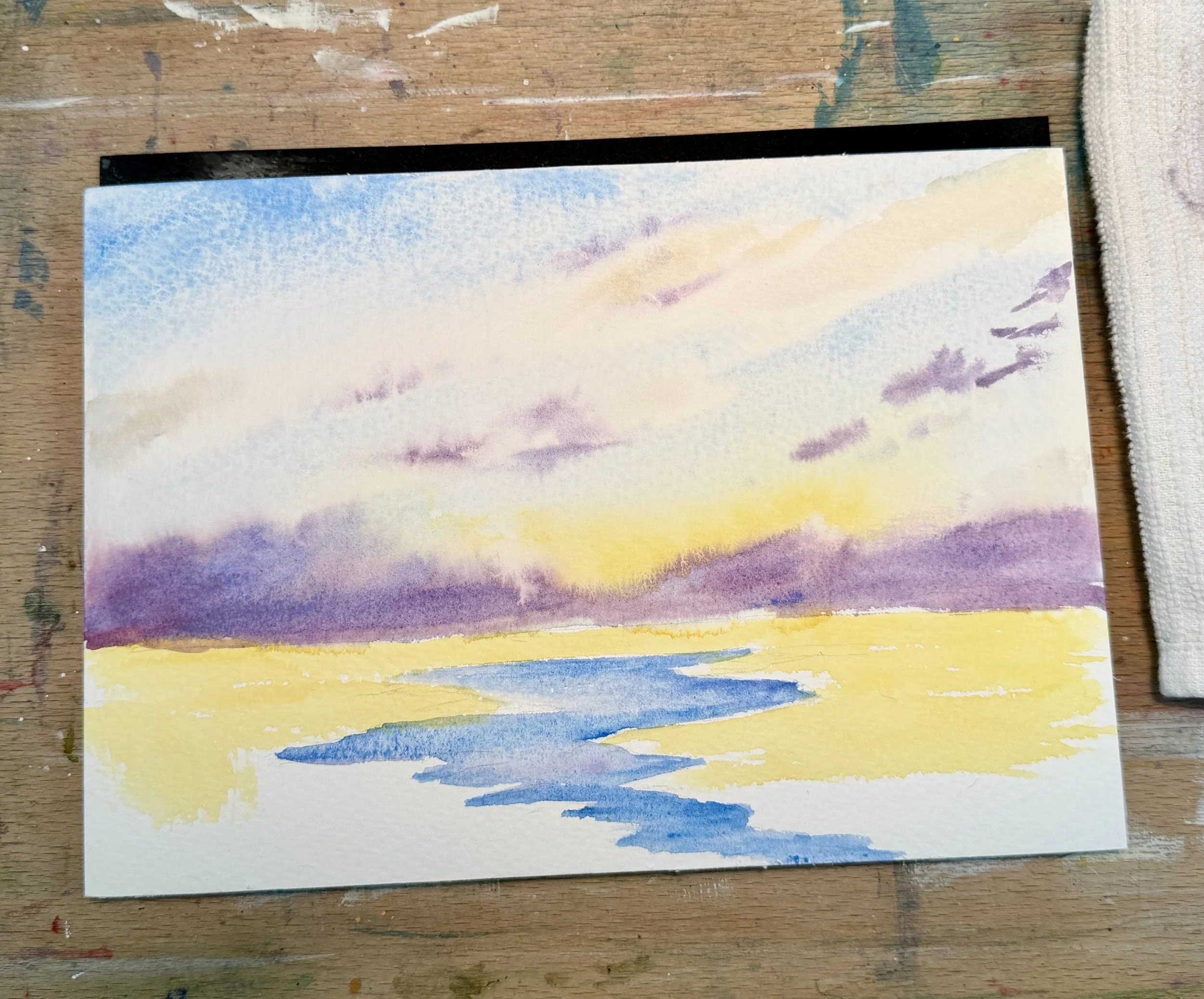
My sky I put down wet in wet using cerulean, some palette grey, azo yellow, and Schmincke violet and imperial purple. Probably got a little more bleed between the yellow and purples due to the granulating effect of the Imperial purple, but I do love the way the pink shows through the purple like it does in the original. I can try to clean it up a bit later. For the middle ground, I used a layer of azo yellow and laid the cerulean into the water feature. I lifted some, added a touch of the purple to the water to give it depth and interest. then, I dried the whole thing off.
For the wam glow, again, I used quin gold (this has to be a favorite color!) varying my paint thickness and brush strokes to create texture. For the trees in the horizon, I used Indantherene blue, violet, and deep sap green. I lifted areas, softened others to mimic the original. All of those soft lines are really easy to replicate in watercolor! For the darks in the foreground, I used indian red, quin sienna, VanDyke brown and some neutral tint. From a distance, the original looks like one big dark blob at the bottom, but as you inspect further, there are shapes and suggestions of depth and stones or other things. Once again, you want to convey the sense of those things without painting them in by varying the stroke and color you are applying. (I, once again, forgot to document this in between step. UGH)
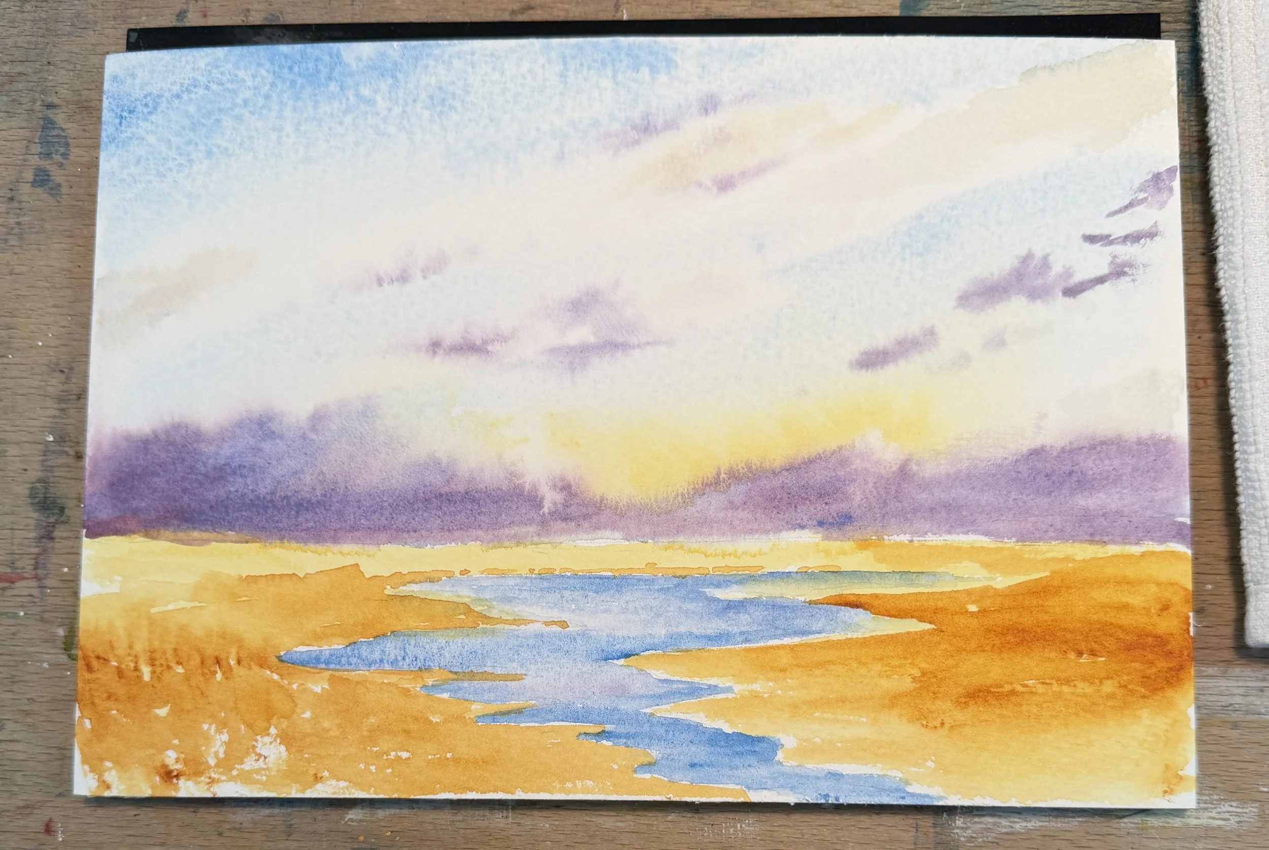
Comparing the study with the original, I feel like it is almost there. The sky needs a tad more pink and yellow, the water needs some shadowing and then I add one more layer of dark to the foreground.
This time, I am very satisfied. This study really aligns with the kind of watercolor painting I do, fits my style. It will be interesting to see if over time I can see a difference in my style. If doing these studies will change the trajectory of my own journey. I guess we will have to wait to see. Happy Painting!