Expressive Tonalism
In my last post, I said I didn’t understand what on earth was meant by Aesthetic and Expressive Tonalism. Well, nothing like a little painting lesson to teach you something. This time I referenced William Gedney Bunce’s Venezia which is similar in subject to Venice, Sail Reflections but done at a later time, 1885 vs 1900. Oh what a difference 15 years made!
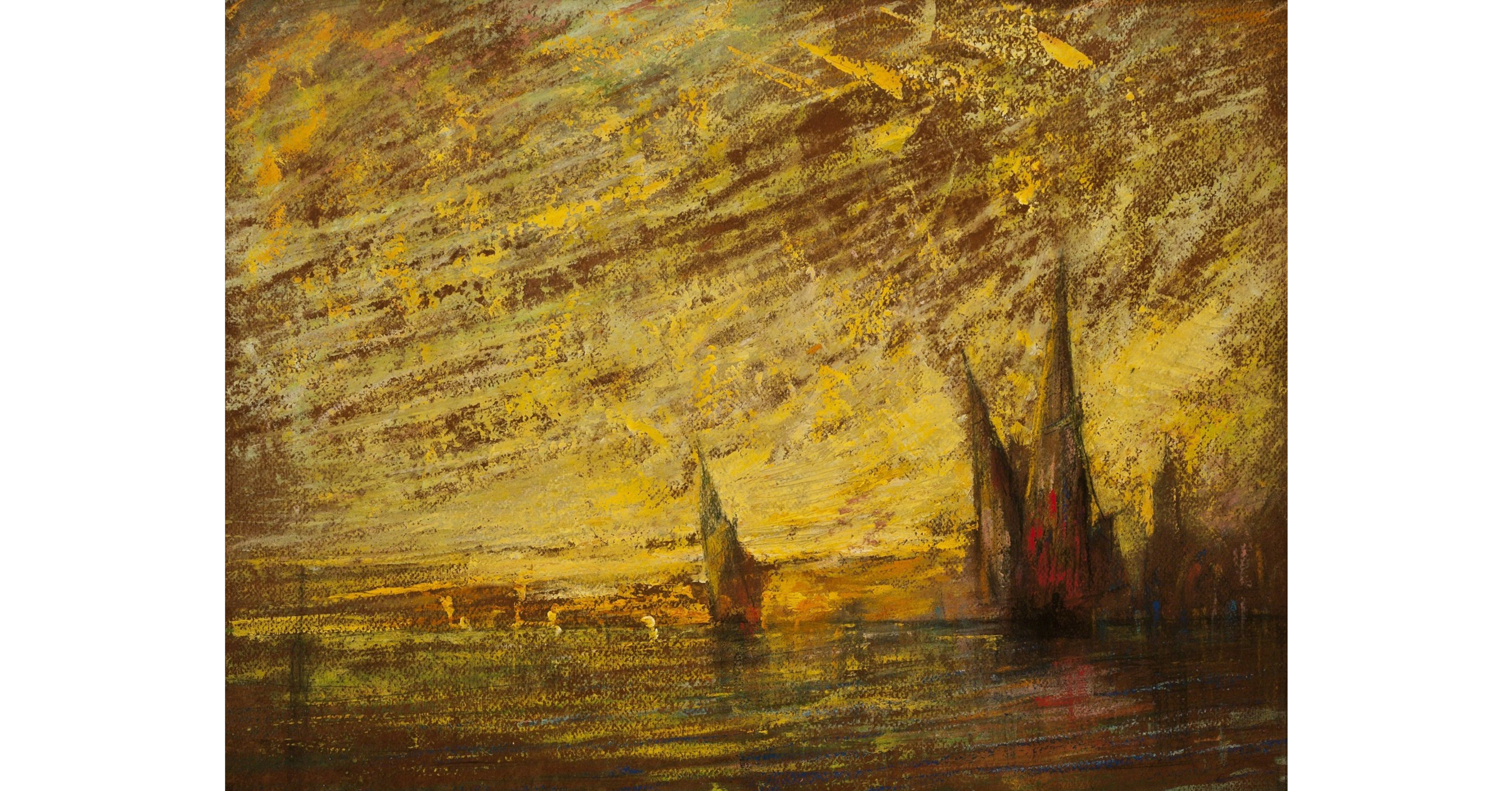
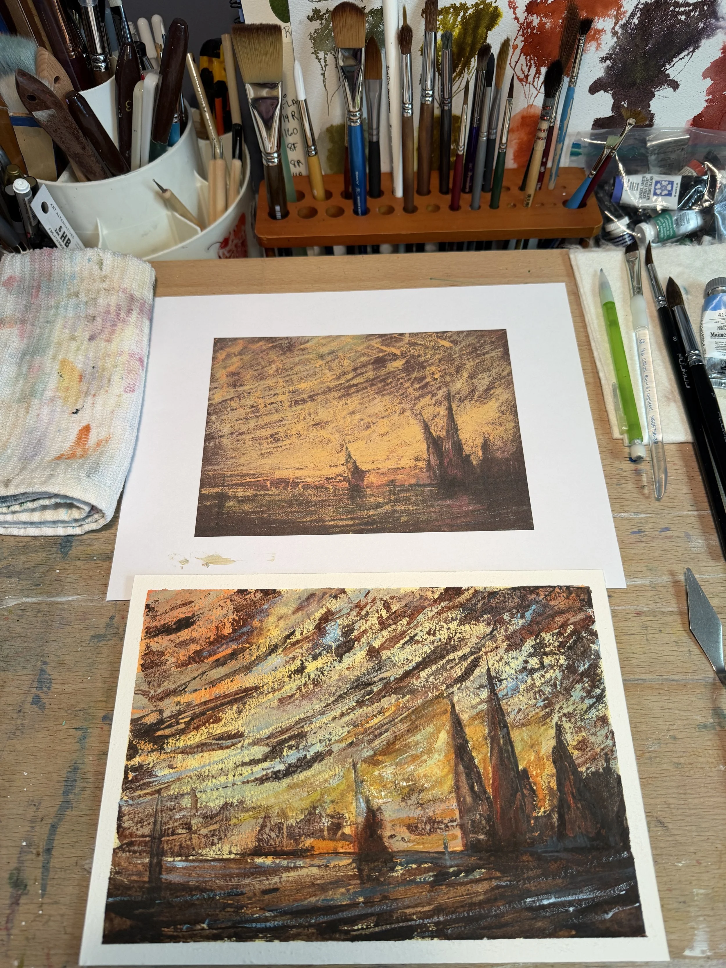
The Original Oil by William Gedney Bunce, Venezia, 1900
In my last blog, I painted the sailboats in the aesthetic form, using similar colors in the boats, sky and water. It’s very pleasing to the eye. Calming even. It doesn’t challenge you in any way. You look at it and think, what a pretty painting! However, in this painting, Bunce has gone all EXPRESSIVE on us. We see big bold brush strokes. The colors are dark, but stick to the use of very few colors to capture the entire landscape. It really must have been so freeing to paint like this after conforming to the constraints of the earlier century. Let’s see what I can do with it!
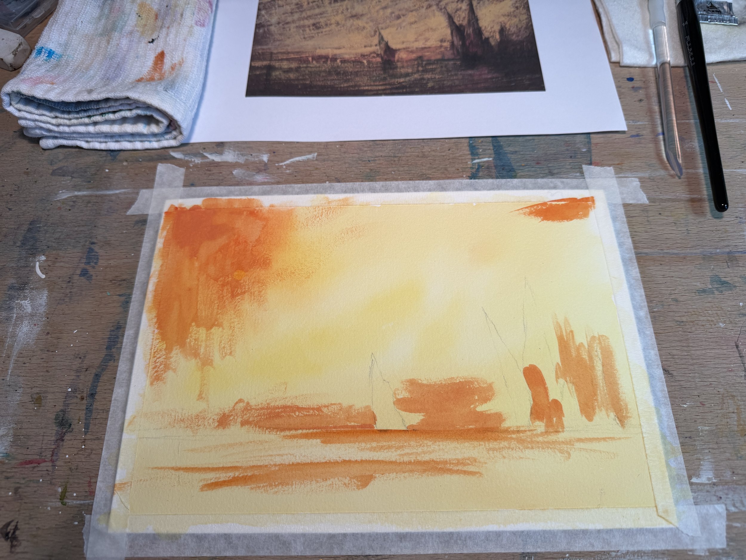
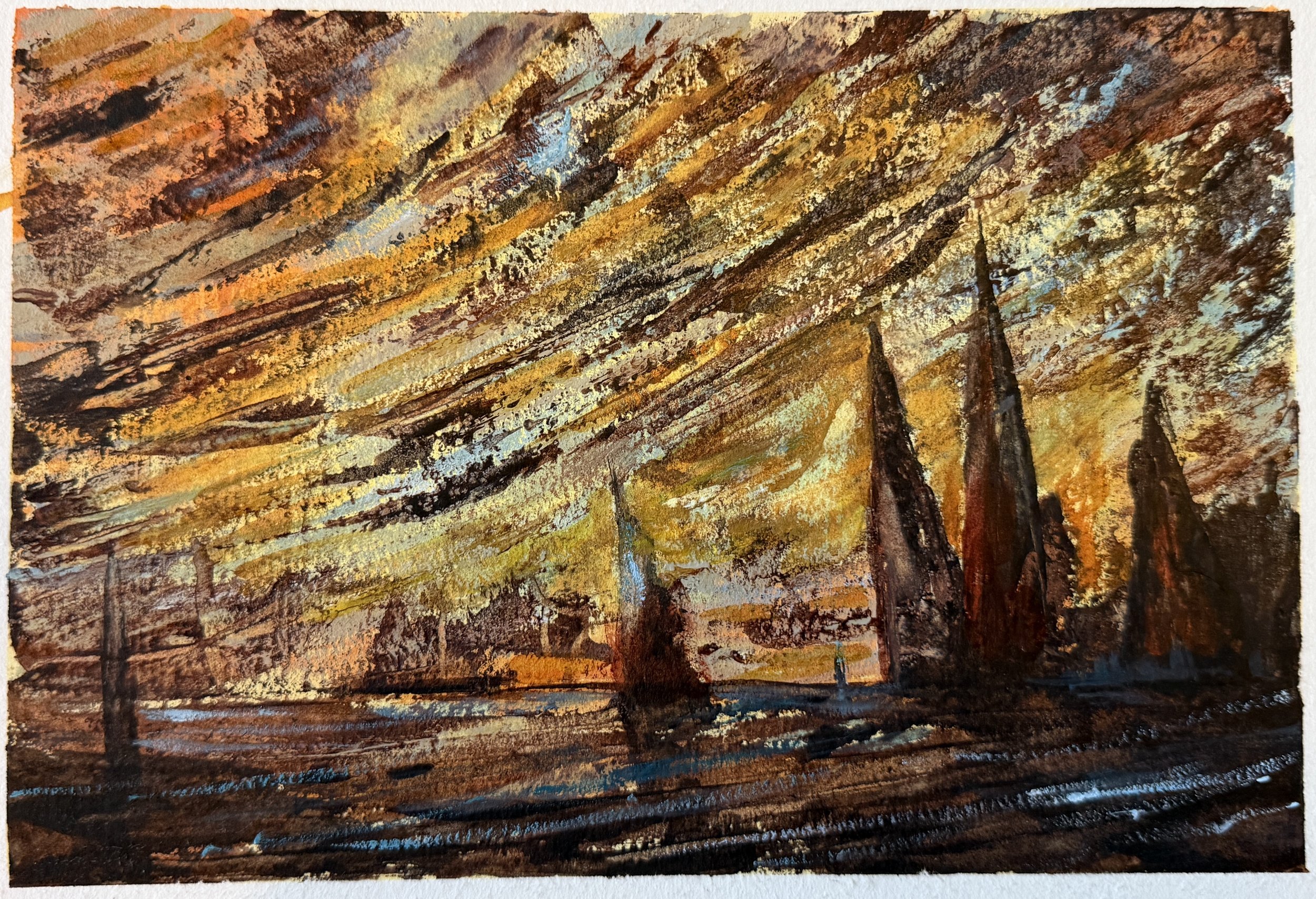
A super simple sketch will do, basically a horizon line with some triangles. Funny how you know what those triangles are… But I digress. I used a wash of azo yellow and transparent orange to create that glow of light that the Tonalists were famous for. Let that dry completely, we are definitely not looking for blending here.
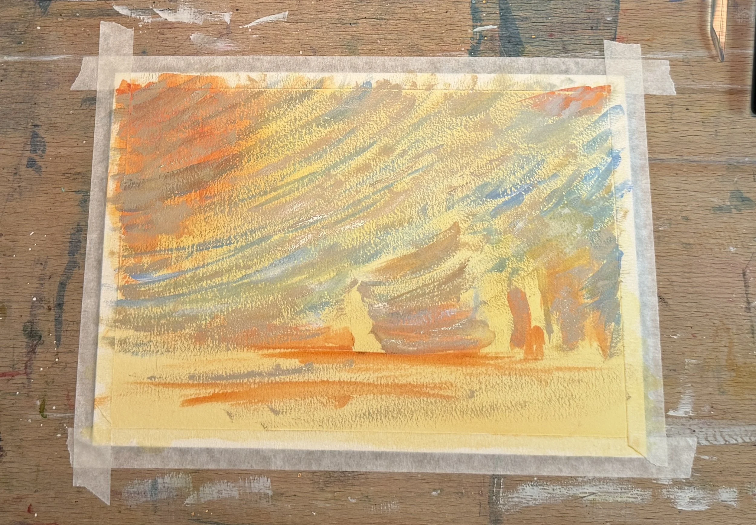
In order to get the opacity I need here, I’m having to resort to using titanium white and buff to mix into some of my colors. I typically don’t do this but since we are experimenting, why not? I use lavender and cerulean with the titaniums to make some thick paint (almost straight from the tube) to boldly lay down some thick strokes of color in the sky. This is the point where I start to question everything as it looks absolutely nothing like the reference. ugh.
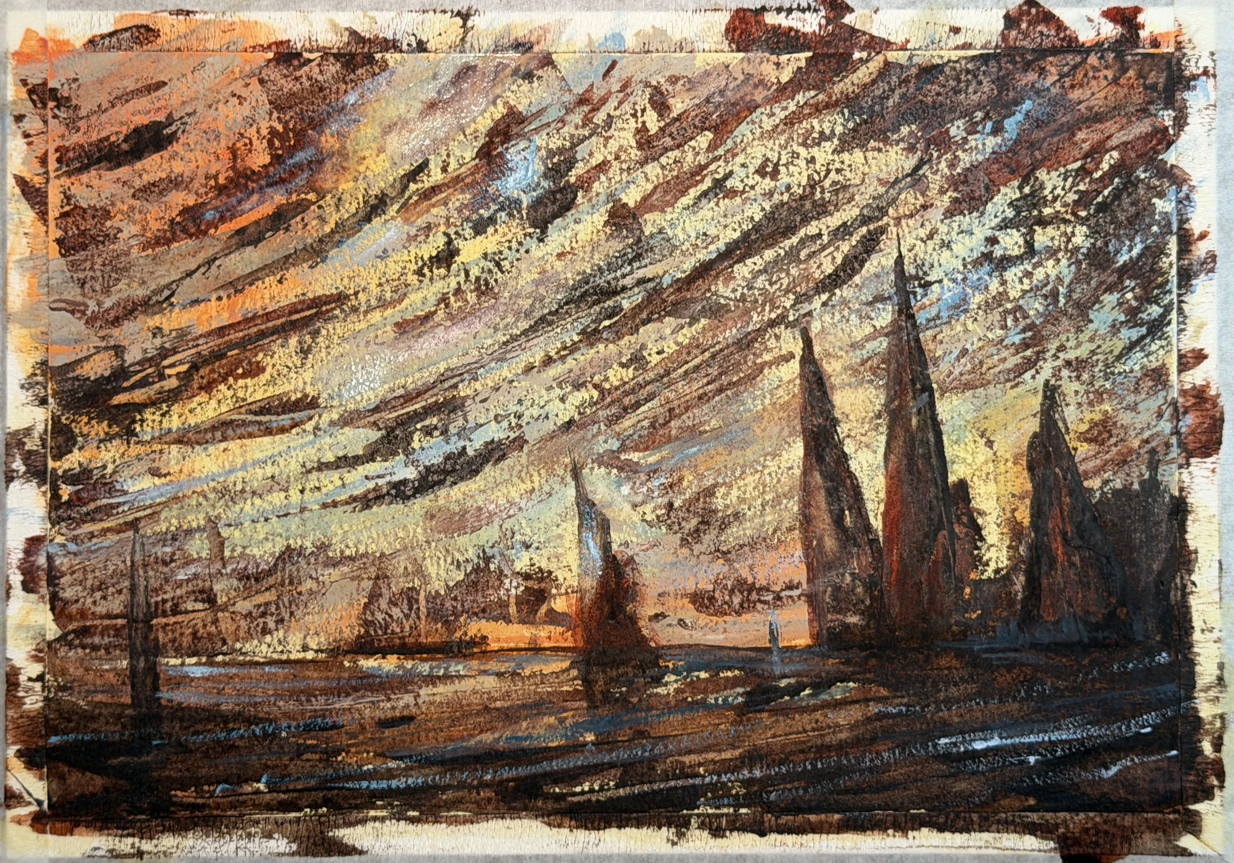
Now, I start adding in those DARKs and boom! For my dark, I mixed together Indian Red, Van Dyke Brown, neutral tint and a tiny bit of lunar black. This mixture was thinner than the previous layer, milky. I varied the mixture so it wasn’t all the same dark. That is really important…on your palette lay those colors close to each other and mix a bit at a time so you can vary it as you go. I applied all of the dark using a palette knife. Crazy, I know. But it clearly worked for Bunce so I thought it would work for me. It took a couple of layers to get the really dark areas dark enough, but I was happy with the way the light shone through the painting.
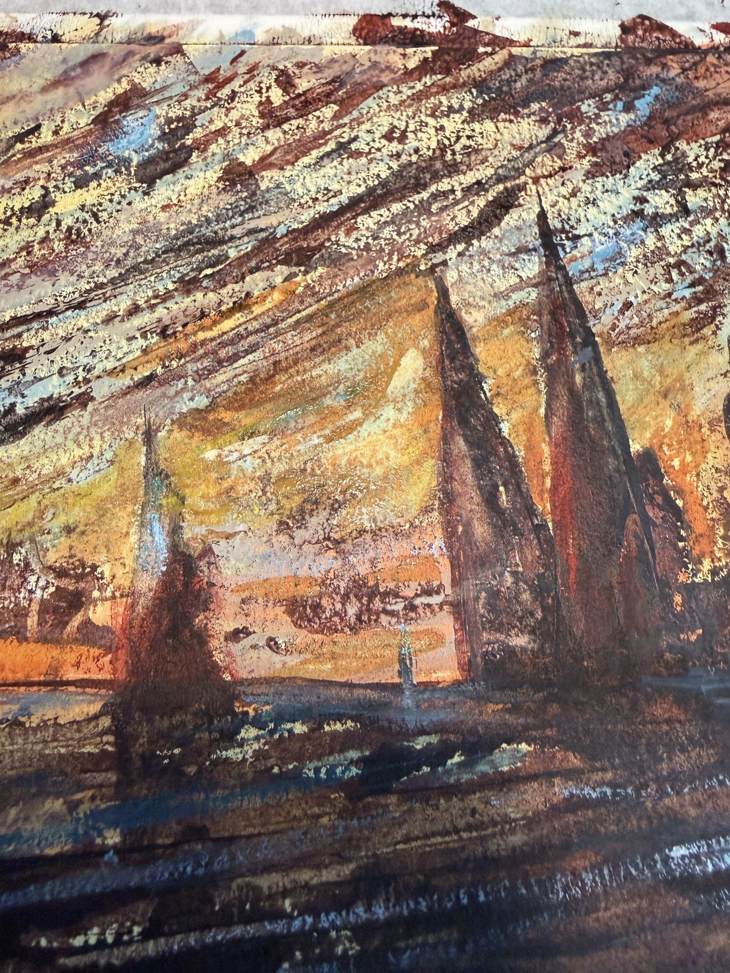
Here is a closer up view. SEE that texture! I did not think I could pull that off with WC.
After the darks had dried, I wasn’t happy with the GLOW. It wasn’t glowing enough. Carefully, very lightly touched in some more yellow and orange. Then, a few highlights of the cerulean and white on top of everything and it was done! Voila!
This is my finished piece. I have to say, I didn’t think I could come close to capturing Bunce’s original. Especially with watercolor. This experiment continues to amaze me. I continue to amaze myself. It’s really been freeing to create this way. I can only imagine living in a time where almost all art looked the same, or similar. Realistic and aesthetic. And then you start doing THIS! What? Even for me, living in a time where we have Picasso, and Matisse, and artists pouring buckets of paint onto room sized canvases from a swing upside down, EVEN NOW painting like this is freeing…EXPRESSIVE! Can I take it into my own work? Maybe…but I have to admit it is scary to think of. An aesthetic painting is easy to like. A painting like this is likely to be “judged”. It’s not for everyone. But dang, it was fun!