Aesthetic Tonalism
The second component of Tonalism has something to do with the Aesthetic to Expressive. Admittedly, I have no freaking idea what this means. Early Tonalists created small landscapes “characterized by formal design and paint handling that is refined and nuanced, quiet and intimate in visual effect” (p. xxviii History of American Tonalism. I will do my best to reference pages but if it is quotes it is from the book or from the American Tonalists website). Later, the Expressive work “illustrates the evolution among leading Tonalists from their early emphasis on a perfectly composed conceptual art to a later energized version with its embrace of personal expression on larger supports, and ultimately, a portrayal of the carrying power of nature’s metamorphic energy as embodied in the paint mark itself.” (p. xxxix)
I’ve chosen the painting Venice, Sail Reflections by William Gedney Bunce to illustrate the Aesthetic beginning of the movement, and next I will try a painting from his later period to compare. The early Tonalists had an attention to detail that faded as the movement progressed. This painting I am really hesitant to begin because it is an oil originally and watercolor doesn’t lend to the bold strokes we see here, but here goes.
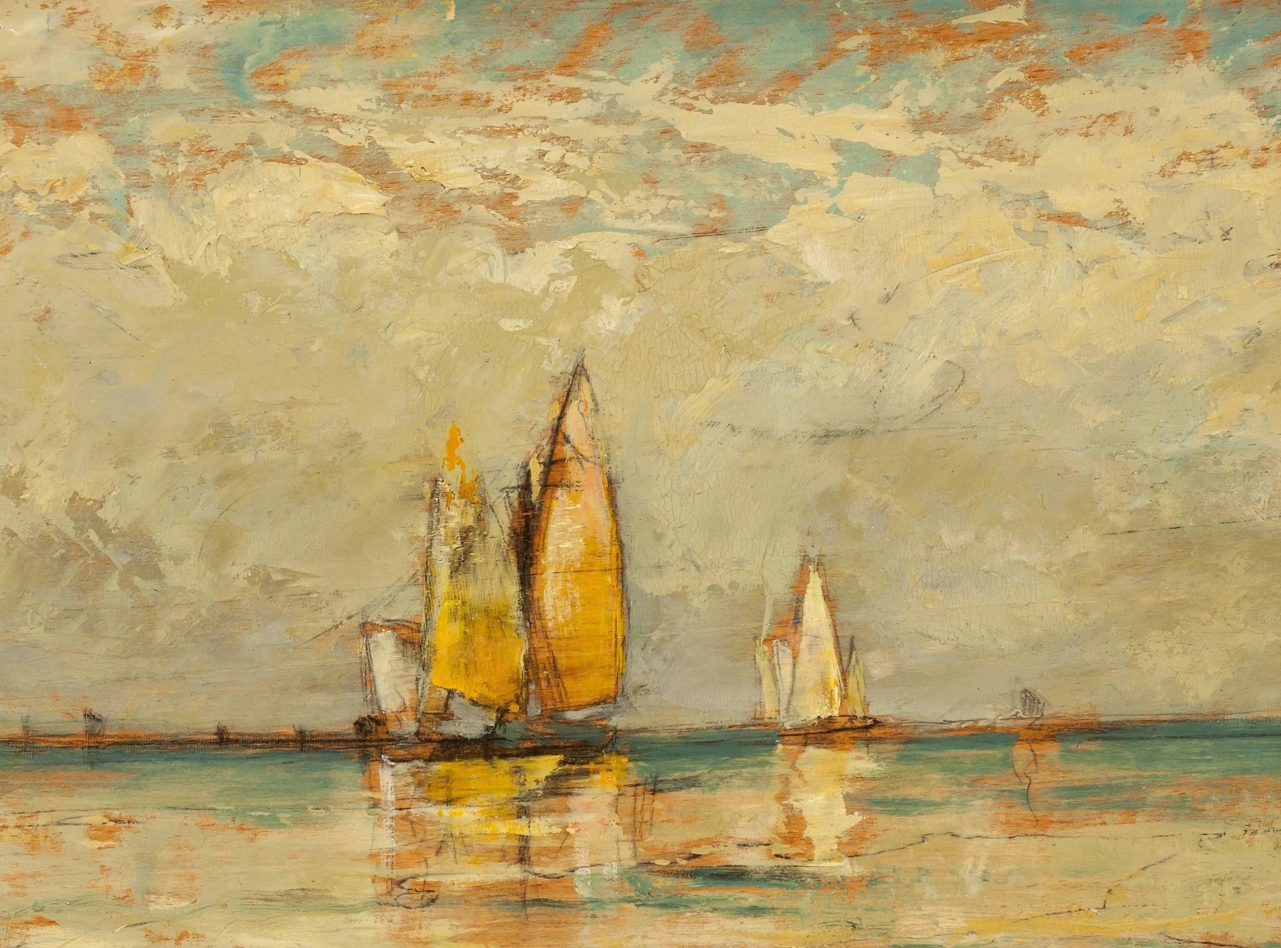
Original Oil by William Gedney Bunce, Venice, Sail Reflections
Bunce’s painting is really quite simple in reality. Simple sketch where the drawing actually shows under the paint, a base layer of probably burnt sienna, and thick strokes with a brush or palette. But watercolor poses a challenge because we work light to dark. I’m probably going to have to break some rules to pull this one off but here goes. First, a strong sketch, dark pencil lines that will show up through or under my paint are key.
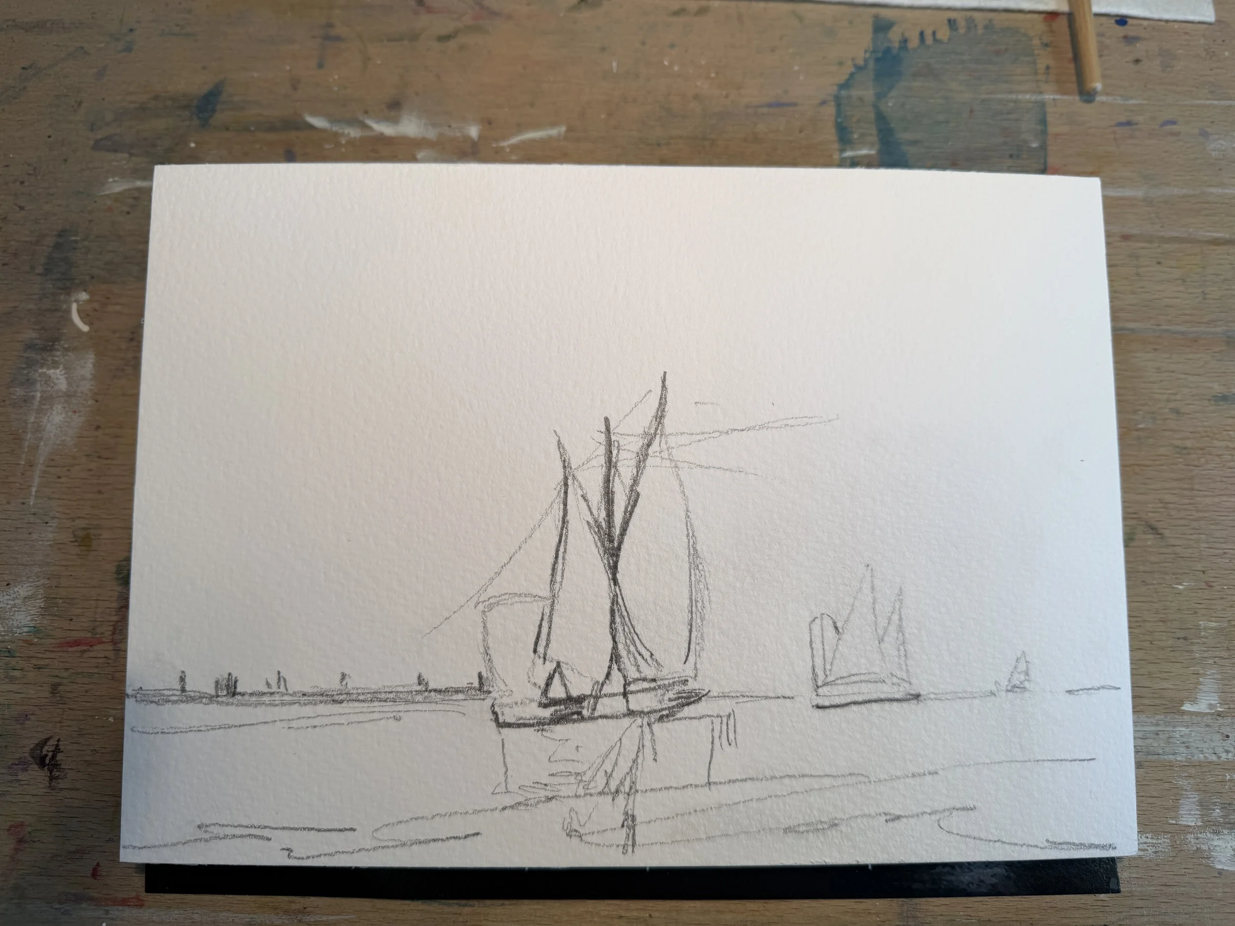
Here is my sketch. I really suck at drawing but who cares. The point is the journey and I’m on it! Now, I know for a fact that where I have that graphite, my paints are going to avoid the paper like the plague. I’m also going to use a very limited palette with this painting: some of the orange mix in my palette, the grey mix in my palette, cobalt turquiose, indian yellow and transparent yellow. To finish off I will be using some buff titanium and some Dr. Ph Martin’s white over top.
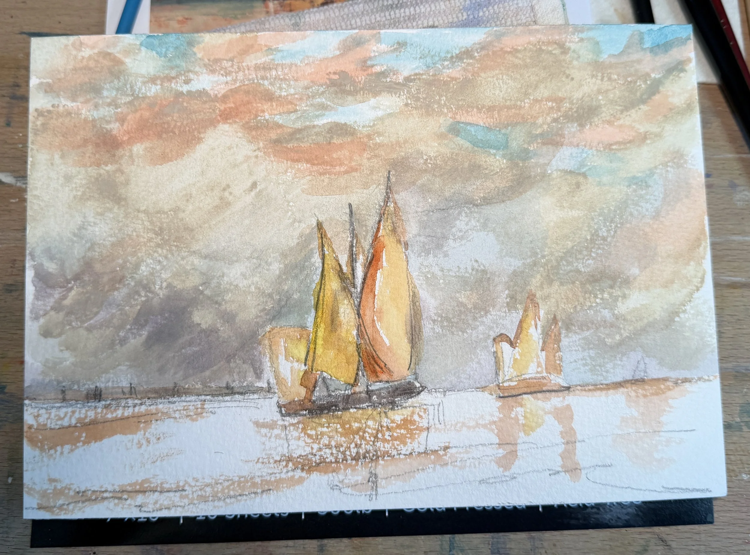
I almost always paint a wet on wet sky, but the bold strokes of the original just call for me to use strong paint, long strokes and dry paper. I do plan on going back later to add the white and buff to the sky so here in this first layer I am trying to establish those bold apricot and turquoise colors. For the greys, I am just using paint in my palette. That is one of the wonderful things about watercolor, you rarely waste paint! For the sails, I grab a mix of indian and transparent yellow plus some of the orange in my palette…its a mix of the oranges I just play with until I am happy. Once again, I plan on adding quite a bit of white (Rebel that I am!) to my sails so I am going for the colors I see behind. I’m careful to do one color, let it dry some, do another color. I don’t want things mixing and blending at all as this painting is not blended.
Water layer is just cobalt turquoise very strong at the horizon and blended down a little with some bolder spots. I added the apricot colored reflections in the first layer so I’m careful to leave them as they are. Drybrushing this creates the little glimmers of light that are so adored in watercolor, but I might have to get rid of them for this one. Letting everything dry and then I will come in and finish up.
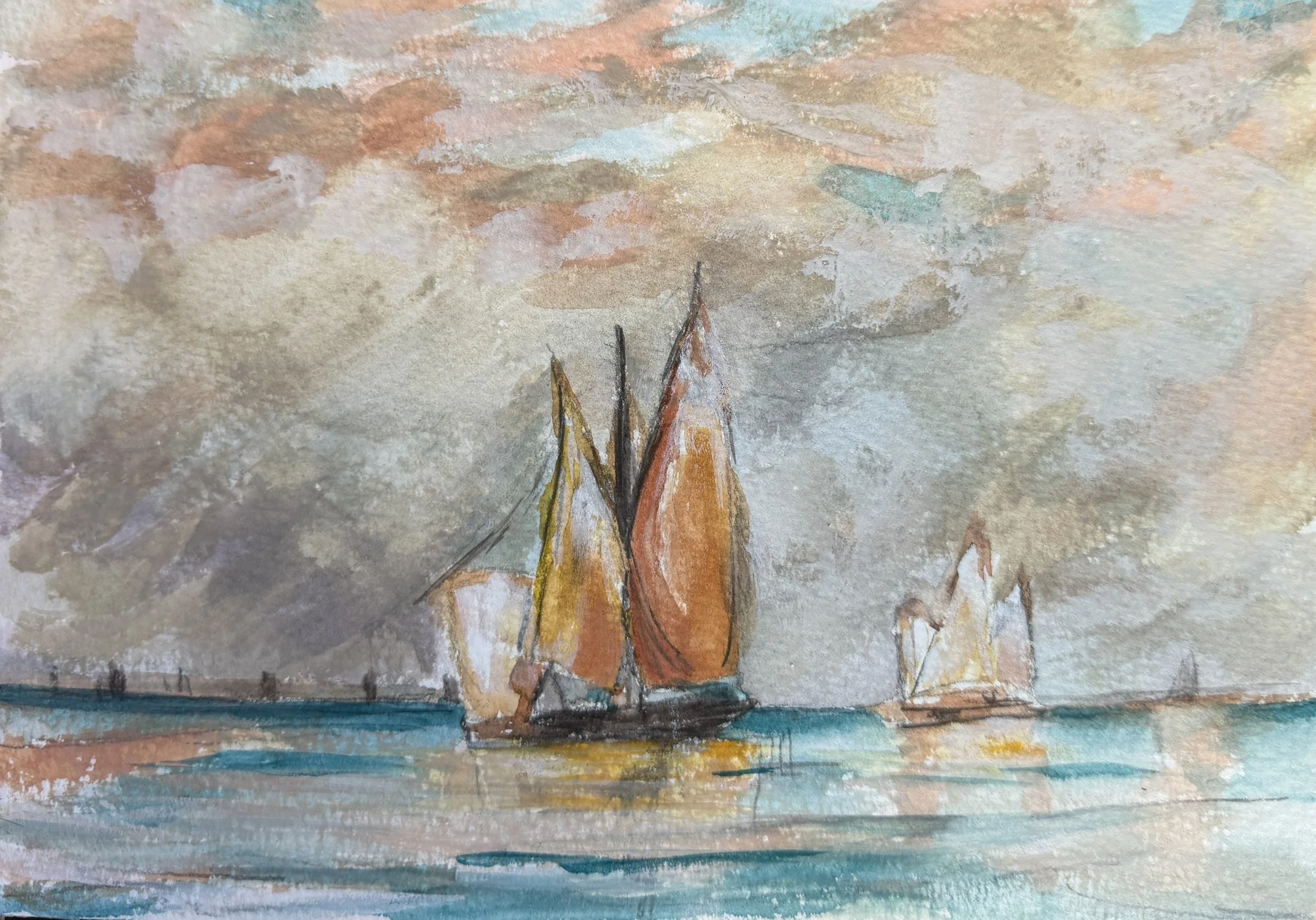
Finishing up, I have mixed some of the buff and white to add on top of the clouds, white on the sails, and I add some turquoise to the water. Trying hard not to over work it . I am so good at that!
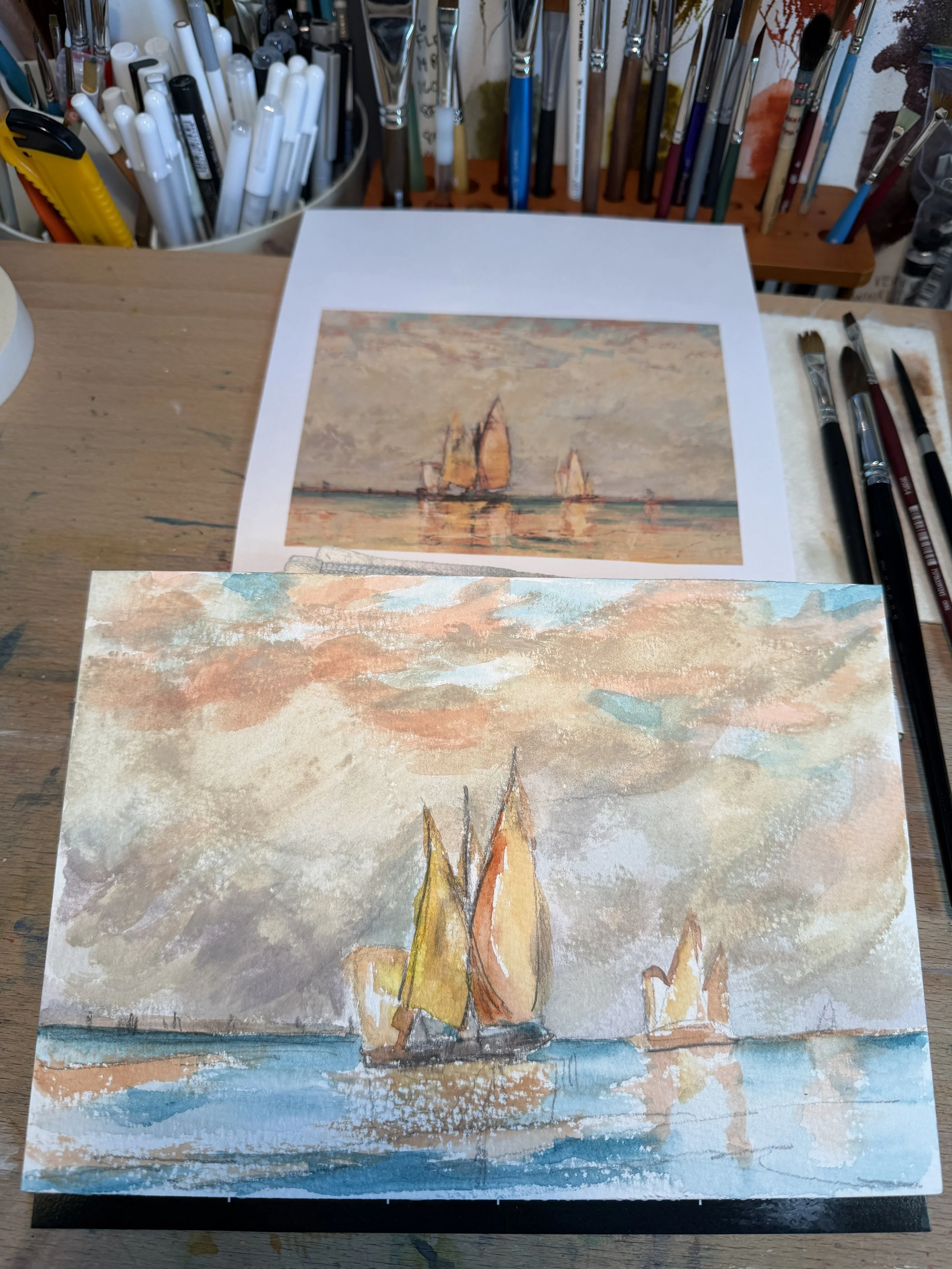
Overall, I really think I nailed this painting, which I did not expect!
What did I learn:
The Aesthetic Tonalism is really simplifying down the subject, while maintaining details. In this painting, it is a very simple scene, very limited palette, but the detailed enough to have that light be the center of attention.
Broad dry strokes can work in WC.
I need some white gouache (is that how you spell it?). This white isn’t quite enough if I have to paint over vibrant colors. Although I think