Using Subtle Tones
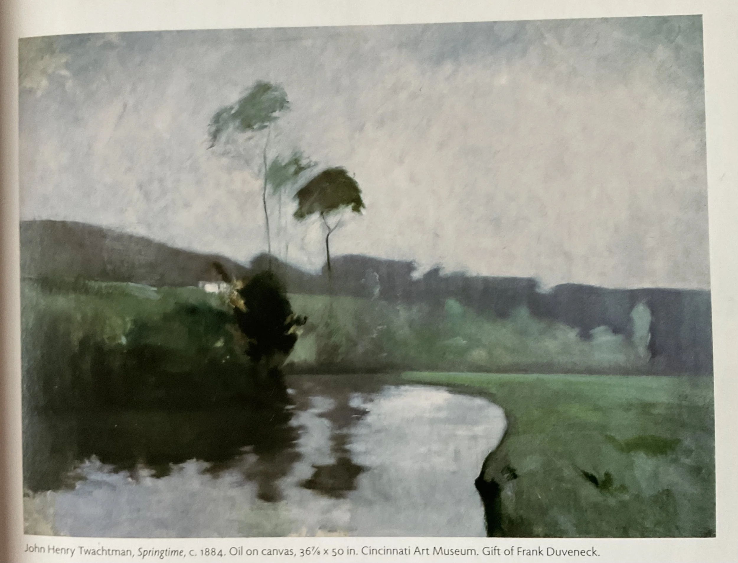
The first rule of Tonalism is the “the use of subtle color tones coprised of various greens, purples, blues and grays that are restful and easy on the eyes.” To illustrate this I have chosen to paint John Henry Twachtman’s Springtime. This painting should be much easier to accomplish in watercolor as it is very soft and even the darks have soft edges. I will be using the greens and browns from my palette along with some cobalt, ultramarine, and lavender. This time I am painting on NY Central Art Supply 300lb cotton paper. My first time using their 300lb. It’s also a 7x10 since painting super small was just not an easy thing for me to do and trying to overcome that hurdle is NOT the point of this experience.
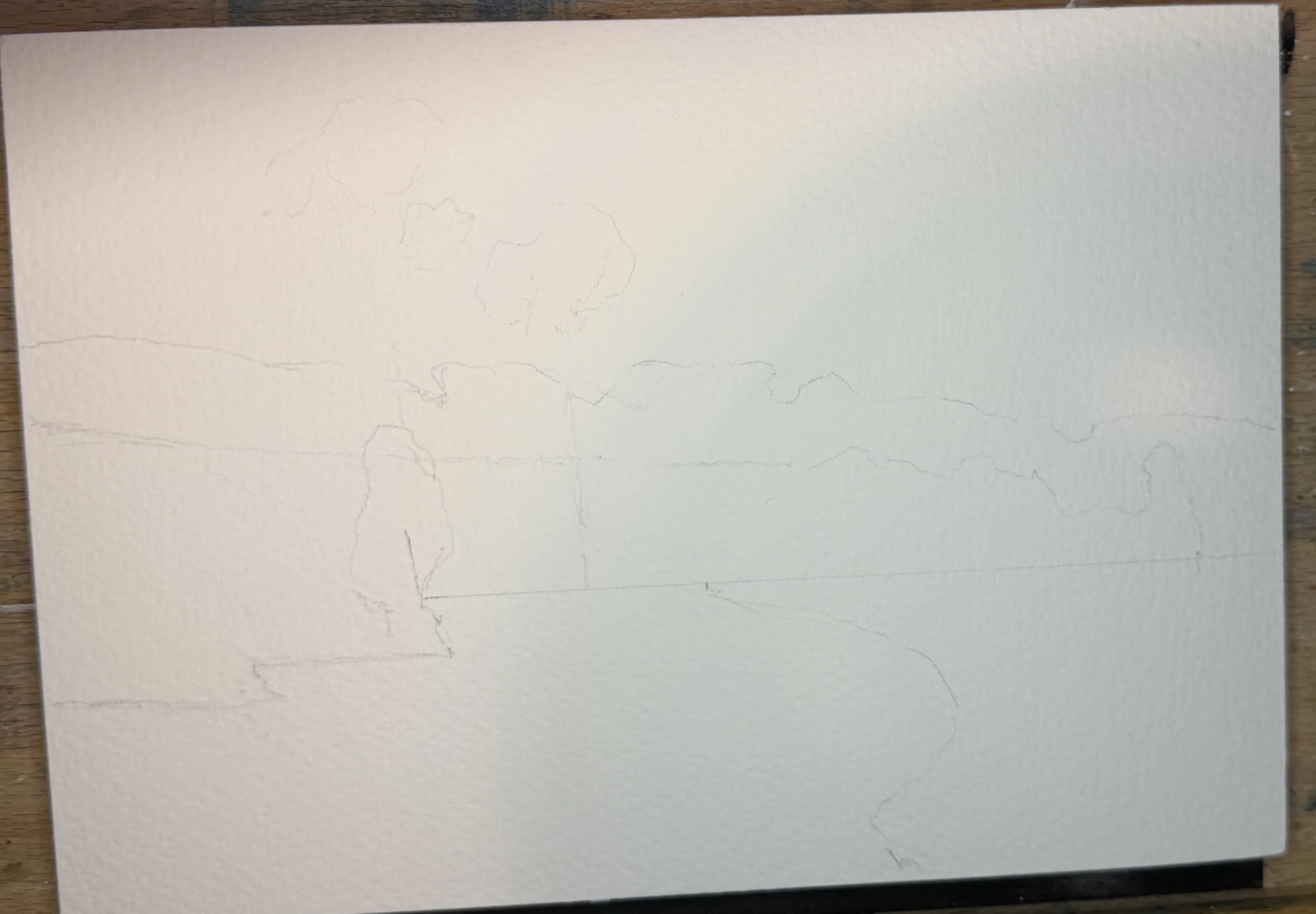
Firstly, we get a little sketch going. Remember, I am not copying these painting but doing this exercise to learn from them. So if my, or your, sketch is not exact don’t stress about it. This is not what it is all about.
Starting with the sky, I’ve mixed up in the grays already in my palette some Cerulean and lavender, being careful not to overmix it. By leaving it in blotches, we can use it to achieve the different colors in the sky. I really love how this paper is picking up the granulation of the Cerulean and creating the texture I see in the oil reference. I’m going to give that just a few seconds to dry, not too much because I don’t want cauliflowers, and then I am going to work my way down the landscape into the line of distant hills. I do want that horizon line to stay soft so if the sky has dried too much you can come back in and soften the edges here and there with a damp brush. I’m always adding a bit of blue or a different green to the mixture so that we don’t have one big block of uninteresting green. This distant land can be bluer than the rest since it is further away. I didn’t get the shade right the first time but that is ok, because we are making it much darker later. Carry those greens down into the field, add some darker green and lavender, and the trees on the left. I should have done my water when I did my sky, but once again, no worries, adding it in now and getting soft edges by the shore is fine because we want those anyway. Plus, we can add in the reflections of the trees we will be painting in the next layer. Here’s what we have after that first wash.
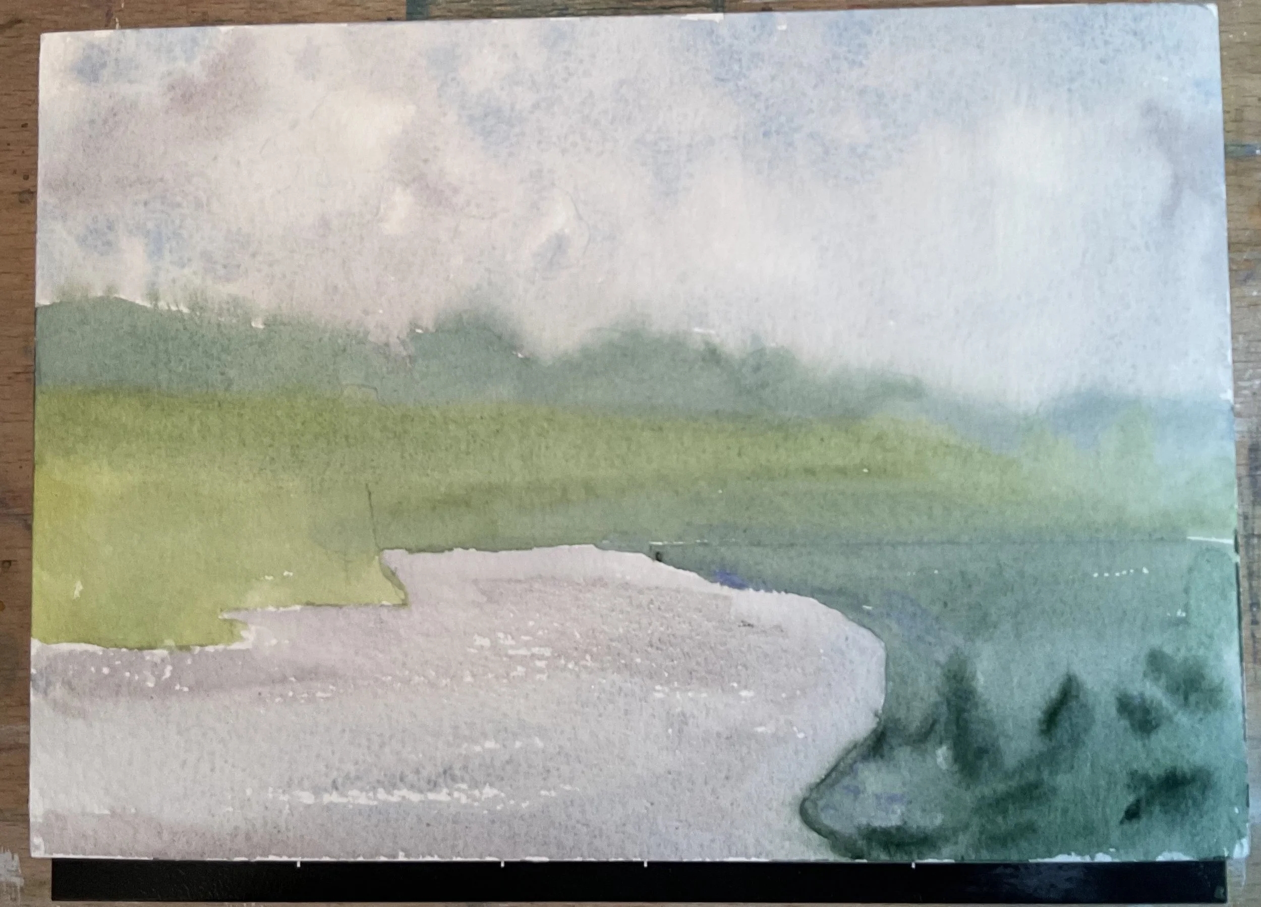
Ok, I’m really happy with that first layer. Now, I’ve mixed up a really dark green, blue, purplish color for that dark of the distant mountains. Paint in this block of land and then afterwards go back and soften some of the edges, remove some paint and loosen it up a bit. Now, I hit that horizon line on the right with some of that dark color and use a damp clean brush to carry it up into the lighter green hill in the mid-ground. I’ve used some green gold to create the field along the horizon as it has some brightness to it that helps define the horizon. Really be aware of how soft the original painting is and work to keep as many soft edges as possible. For the trees on the left, I see some variation of color but not much. It is basically one big block of green. I paint that pretty much as a big block, adding a bit of yellow, or a bit more water to areas to give it texture without changing the tone. Then, for these tall trees that reach into the sky, I do some dry brush and take a damp brush to it to soften areas up. Layer 2 done.
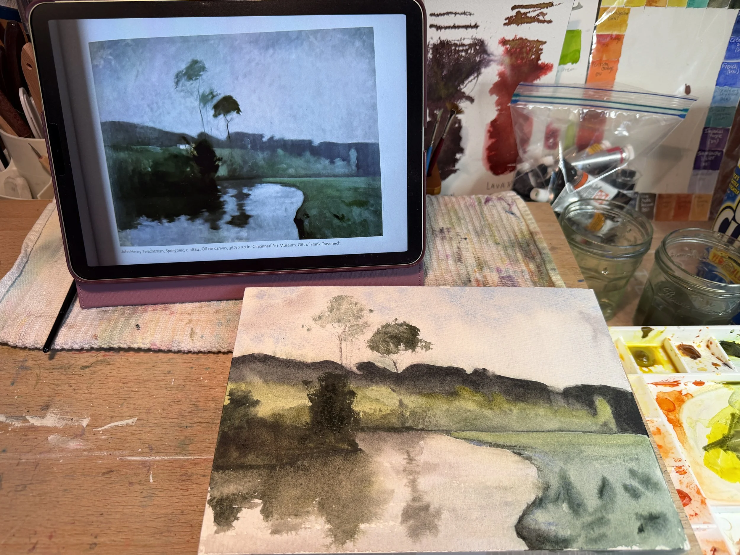
My set up as I work
I think it is getting close. I forgot to leave the white for the house in the hill, but a little Dr. Ph Martin’s Bleed Proof White fixes that right up. The darks need to go darker still, especially along the riverbank, so I add some more darks to that area and soften with my finger. My water is a little too gray, so I add a mix of cobalt and UMB to it. I carry that down into the water again as well. Tree trunks…my ultimate nemesis I swear!…need to go in. Very watered down grey, smudge with the finger, break them up. A bit more dark on the righthand shoreline. Then I dried it off and took one last look. I’m not happy with how yellow the mid-ground turned out so a wash of cobalt goes overtop. My distant line is too green but I can’t do much about that now without ruining it. Plus, I keep reminding myself that the point is not to copy but to learn! I toss a bit of lavender in the field and call it a day.
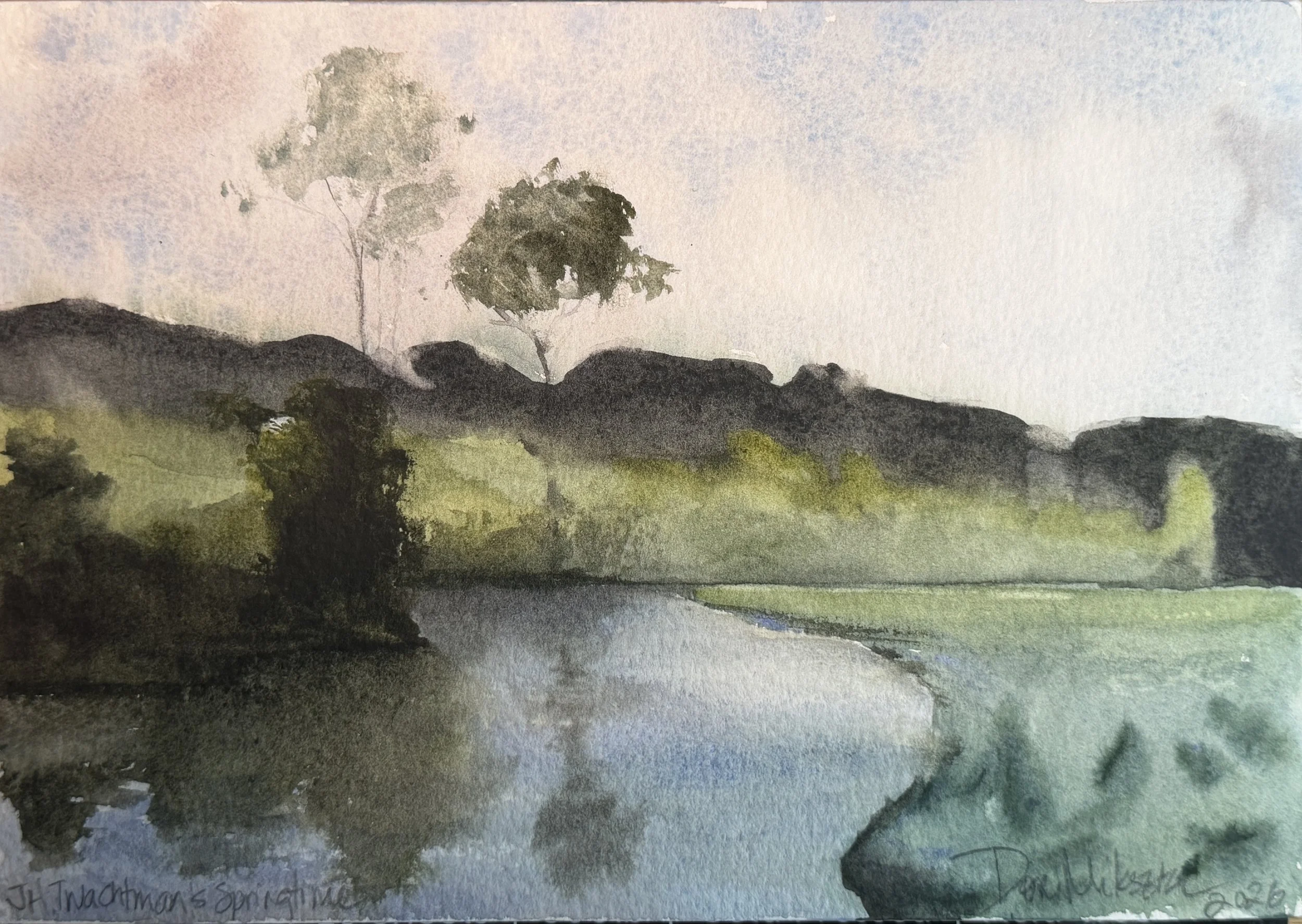
The final painting
I’m quite happy with this one.
What I learned:
I REALLY like this paper! I will be using the back to do paintings I can sell, since you should’t sell copies of other artists works. But NO WAY is this paper going in the bin!
Just a few colors really set the mood for this one and the greens, blues and purples really do the trick. Getting those darks in takes lots of layering in WC but you can achieve a very dark tone.
I should have tested that distant dark a bit more. Also, I think next time I will try some viridian mixes for my greens since viridian is probably the color most oil painters were using int he 1800s for green mixes.
Until next time…HAPPY PAINTING!