The Struggle is REAL
It has taken me entirely too long to get this post up because I’ve had a lot of distractions (trip to Scotland) and I’m gonna be honest, I couldn’t find a painting that I felt I could be successful at. Impostor syndrome strikes again. And sometimes, I just don’t have the courage to just dive in, even if that is the ENTIRE POINT of this learning experiment. So, I’m just going to bust it out, move on and hope for the best.
This lesson’s emphasis is on “the sense of movement or metamorphosis in nature, the vibration and refraction of tones”. Today, I am going to attempt to copy Charles Harold Davis’ Autumn, which was originally done as an oil on canvas. It’s a picture of a fall landscape with a haystacks and trees. "He captures a similar effect usng here broken and activated paint strokes that blur in the eye as the meadow is transformed under fading seasonal fall light, the haystacks and bare branched trees provide yet another reminder of seasonal change”. Part of the technique to achieve this is to use cool overtones into and over warmer colors. I’ll admit that I’m a bit worried about how that will work with watercolor.
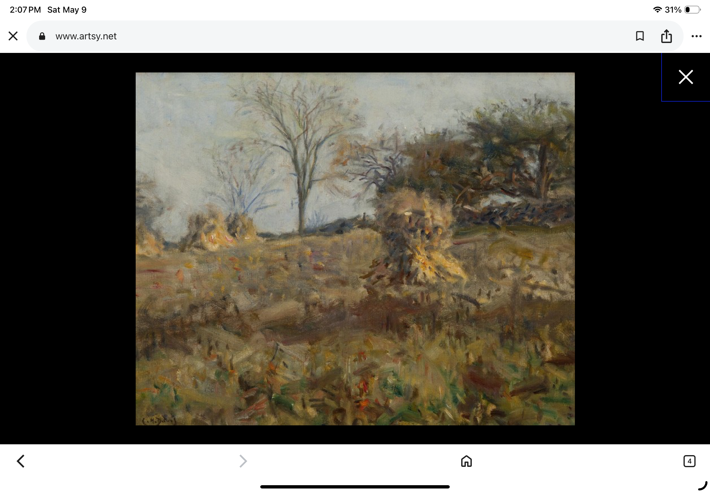
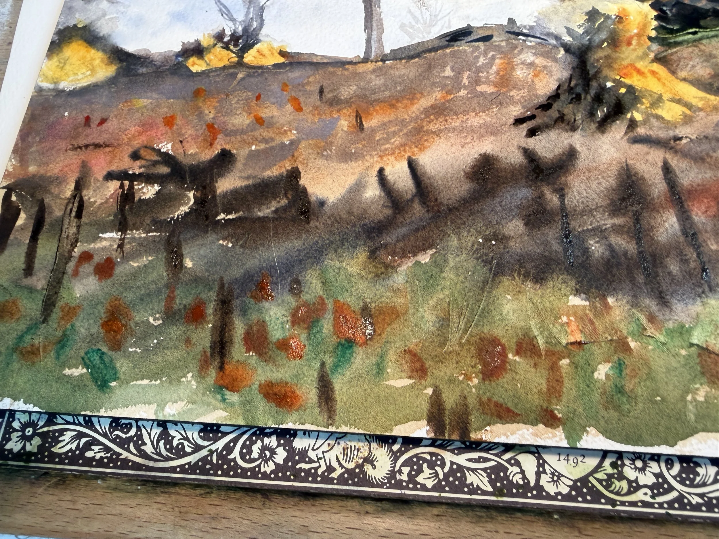
Autumn, by Charles Harold Davis, c. 1910
This is our reference painting.
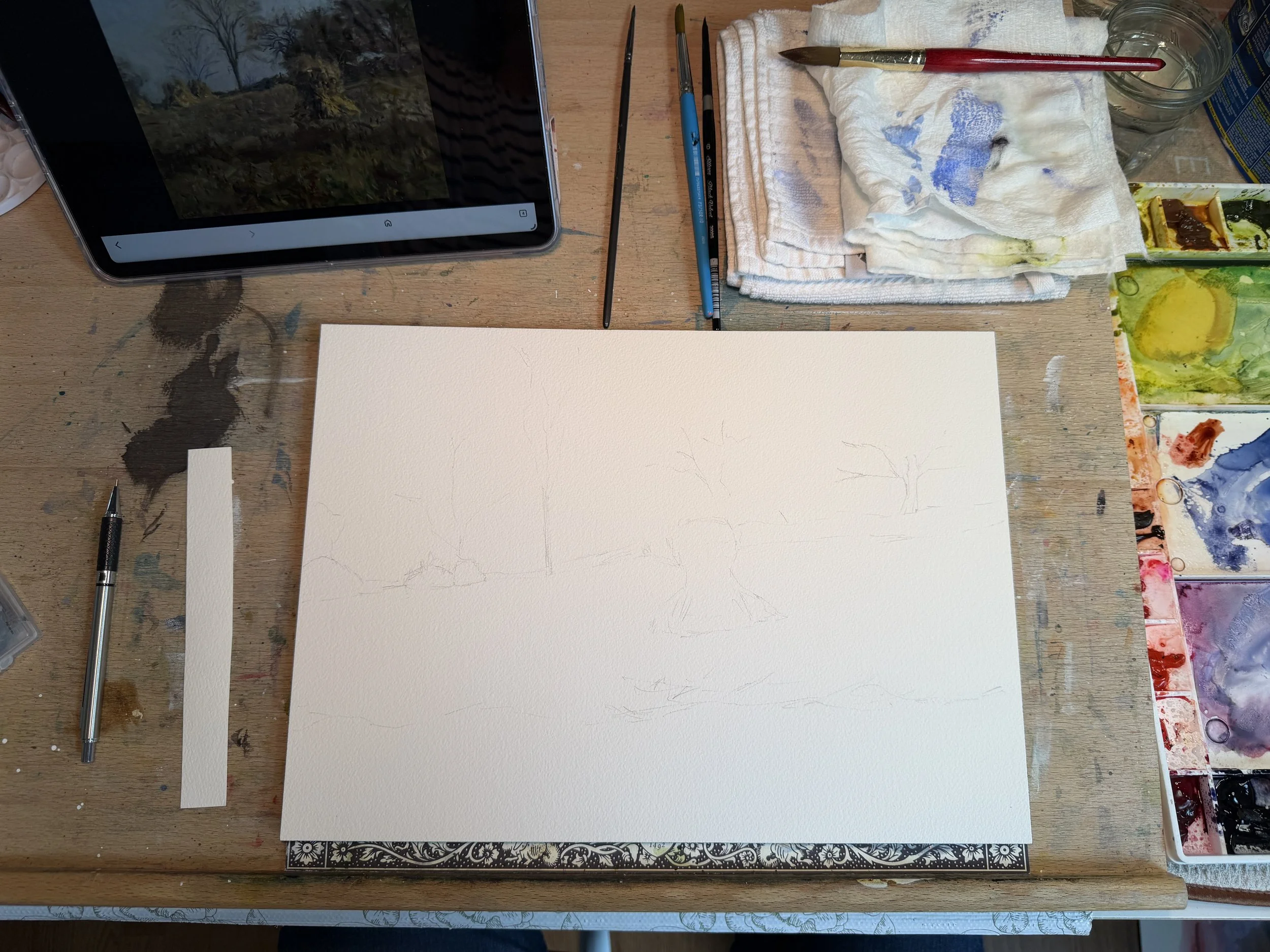
Here is my rough sketch using 10×14 Arches this time.
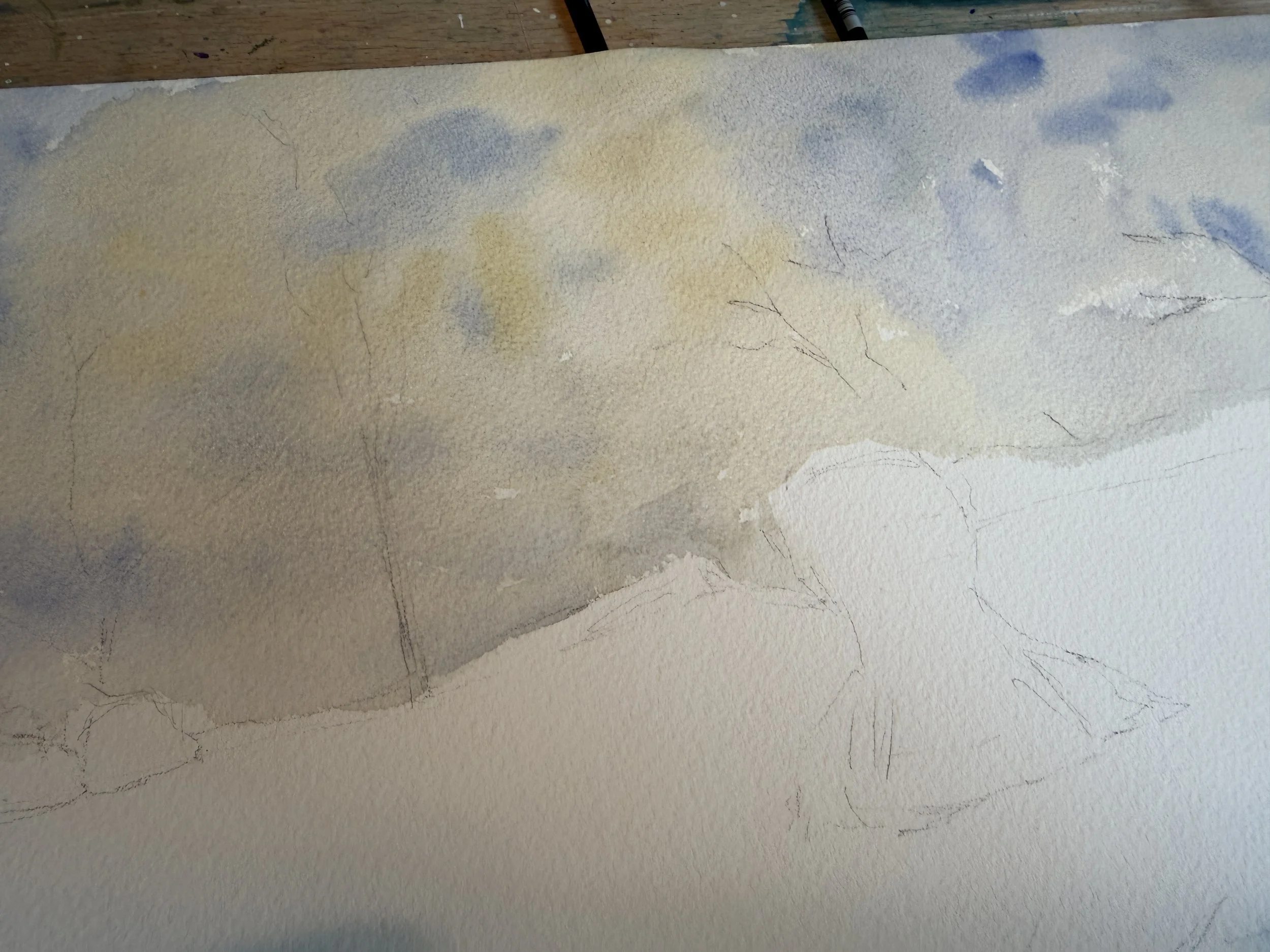
The sky in the reference is a very very light sky. I used a yellow ochre with a lot of water, and added a touch of lavender to that to tone it down a bit. Into that, I dropped some ultramarine blue mixed with neutral tint. I think it worked nicely to show the movement in the sky.
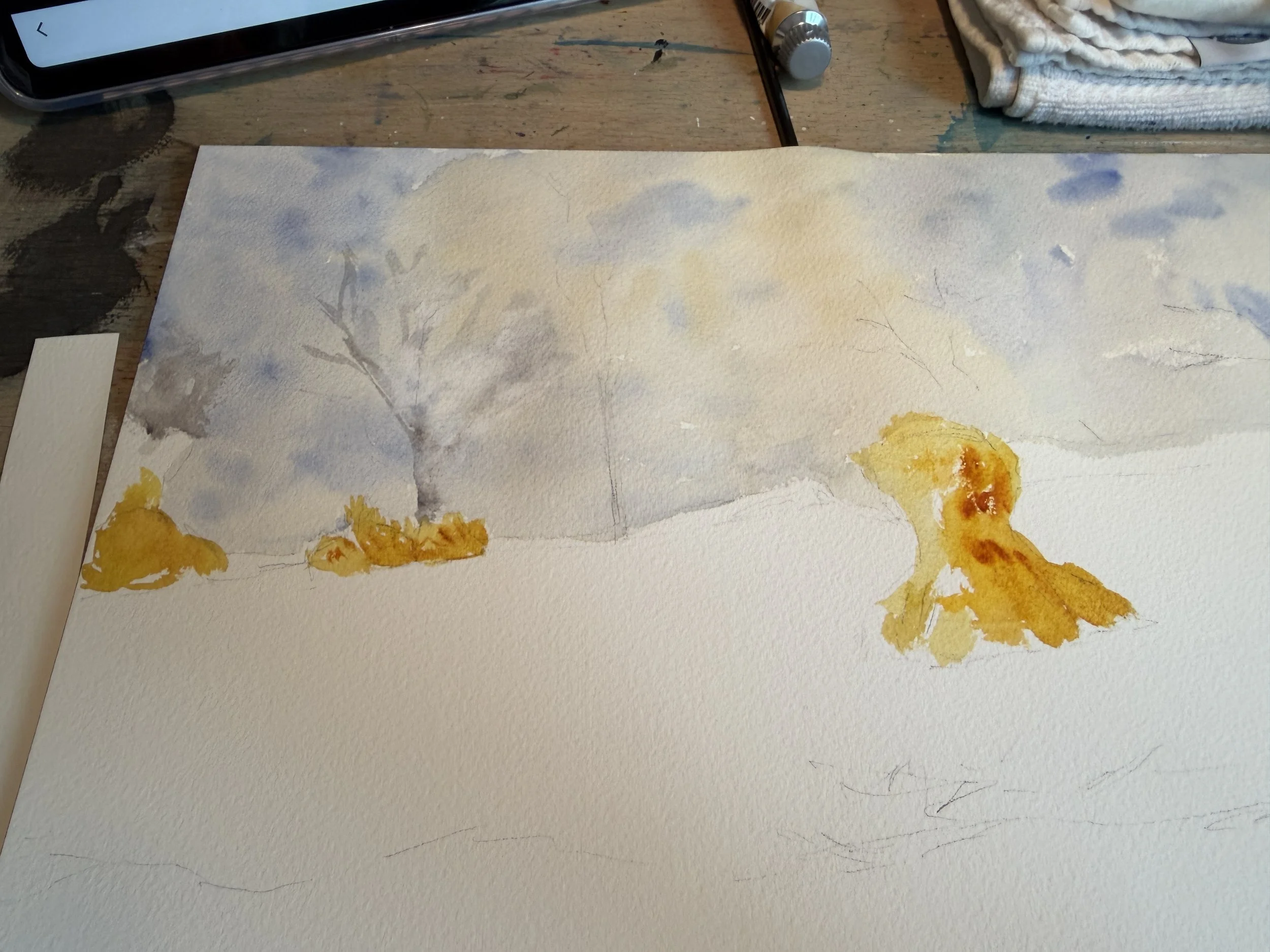
For our haystacks, I’m throwing down some yellows and quin gold to form the warm base.
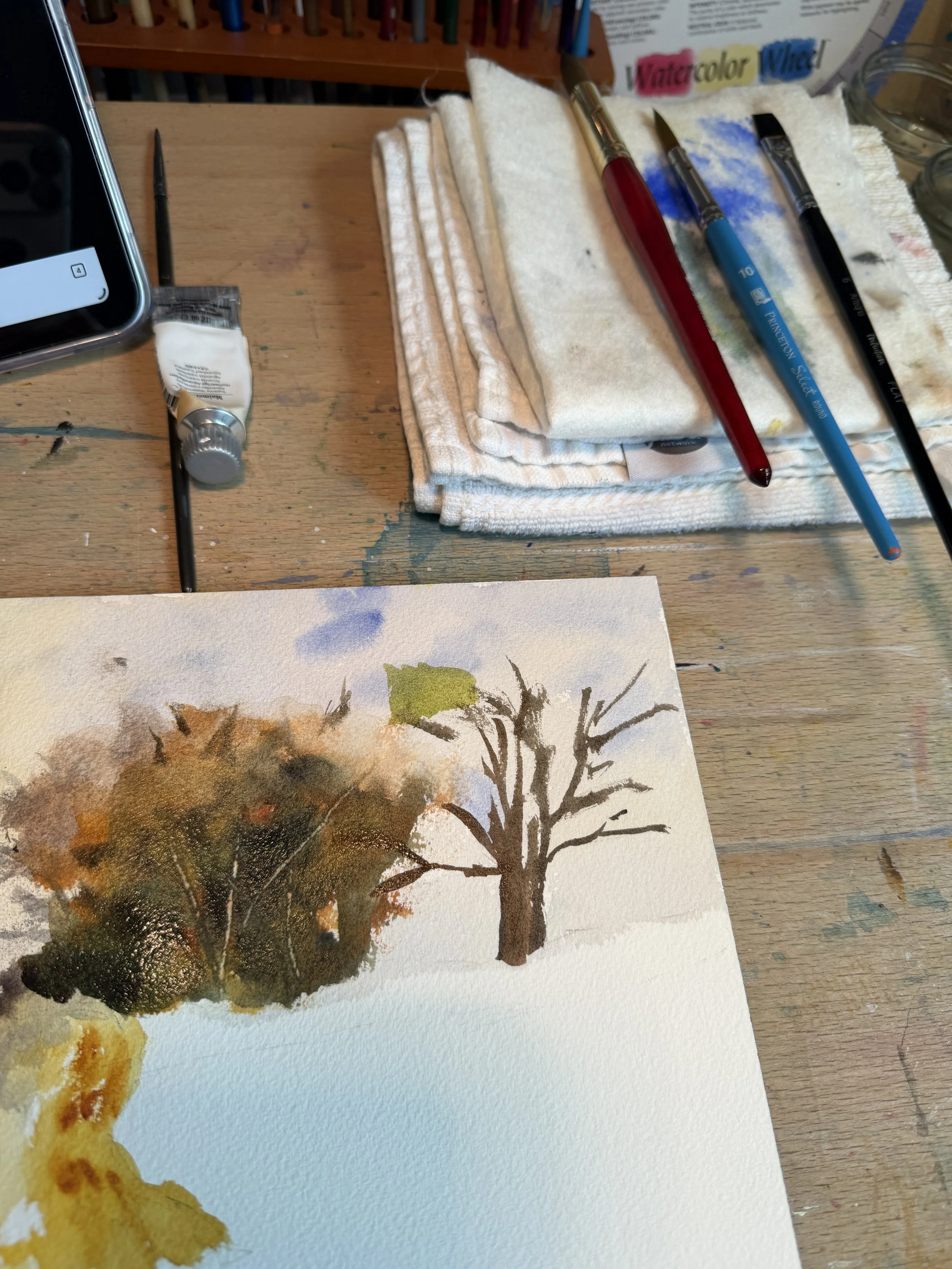
Tackling the trees, I’ve laid down some yellow ochre underneath with a bit of burnt sienna and burnt umber. For the greens, I have used deep sap and undersea green with some neutral tint and cobalt blue because the reference has a very very dark green in here. For the trunks, I’m using a dark made from ultramarine and burnt umber.
I’m just going to say that these are probably the best trees I have ever done. PAINTING FOR 6 YRS NOW PEOPLE! FINALLY getting the trees I want! Yippee!
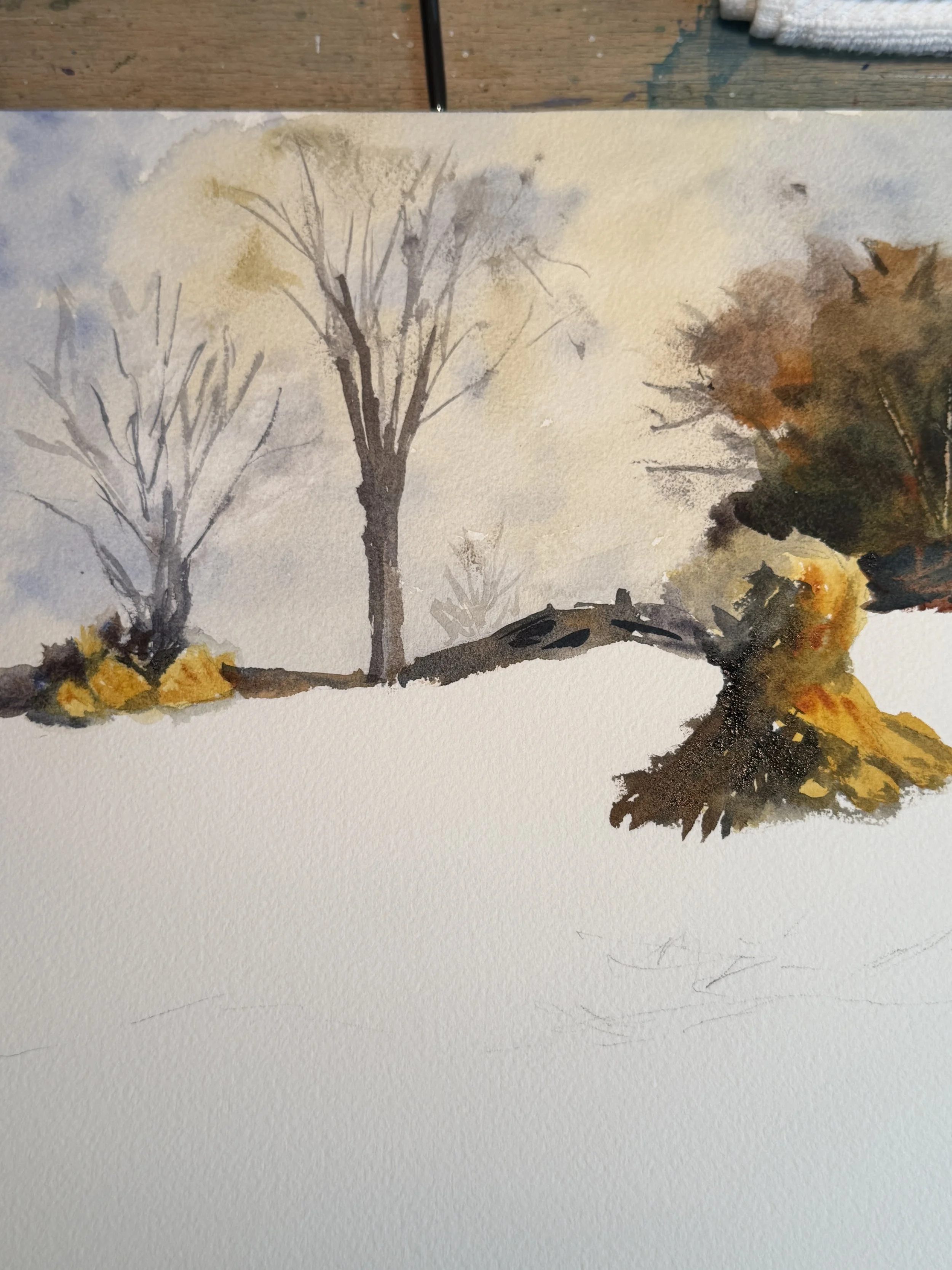
Ok, moving on to that fence line, I used some burnt sienna and indigo with a little payne’s grey and Van Dyke brown. It looks like a fence. It almost looks like his fence. I’m happy with that. The darks I also use on the shadow side of my haystacks. I’m using big broad strokes, trying to keep this painting loose and as undetailed as possible.
The last big item here is the field which is about every color in my palette. Used all of the colors I had used in the rest of the painting along with some viridian and transparent orange. I used some darks and big brushstrokes to make what appear to be posts. And I used a knife to create some scratches in the trees, fence and field for texture. I’m pretty happy with it. This is not at all my style of painting. It’s very loose and not detailed at all. Almost impressionistic. But I think it really does capture the movement and the reflecting light. I am MOST happy with the trees on the left. They are making me smile.
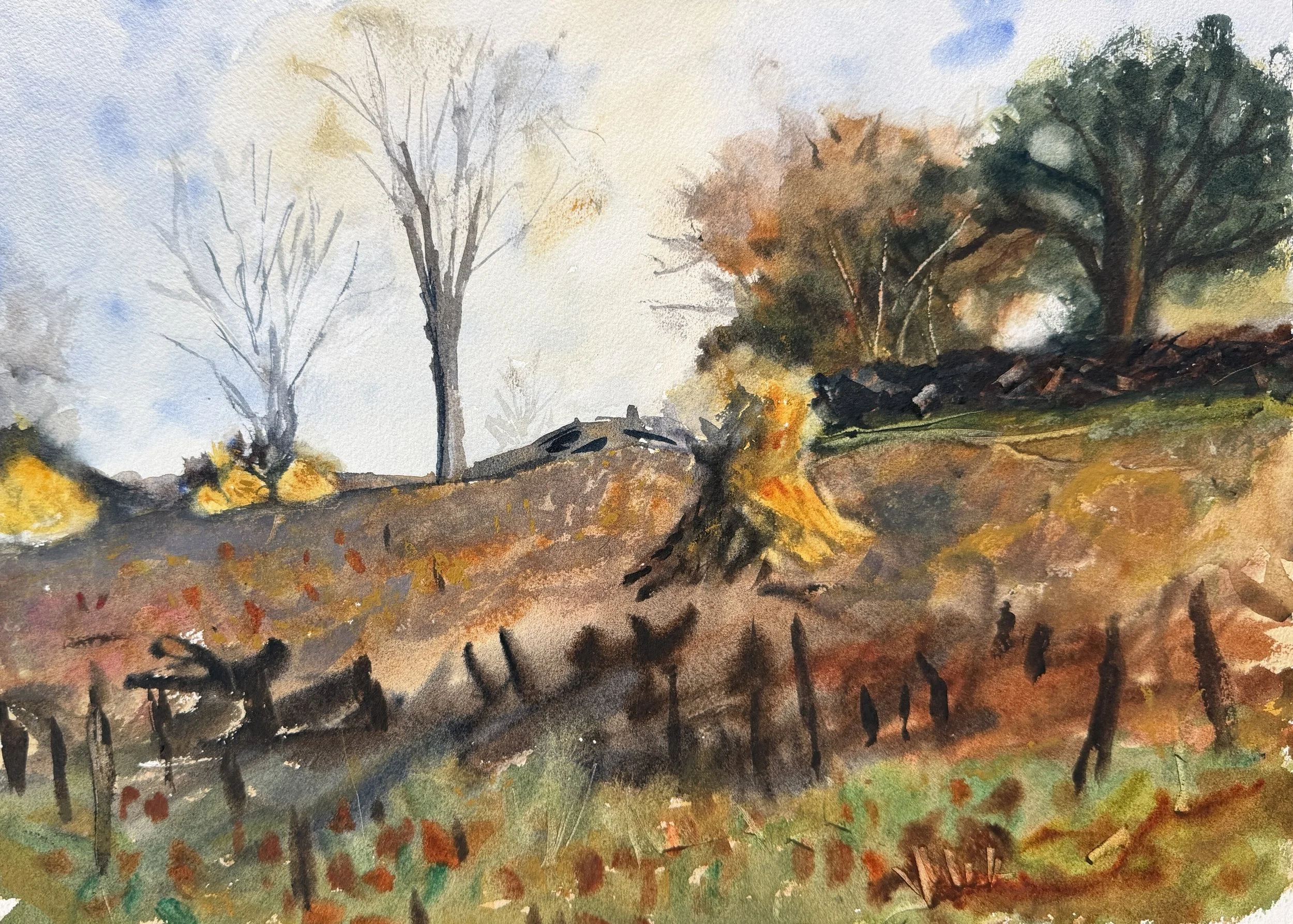
Here is my version of the painting in all it’s glowing glory. Overall, not a fail. Not my favorite painting ever but it did force me to loosen up and use less detail. I think it captures the movement and vibrations in nature. I’m not sure this is a style I would use regularly but who knows. The idea is that studying this style will possibly have an impact on my own style so we will have to wait and see.