They Make It Look SO Easy
I think I was feeling a bit cocky after the last painting, so I decided to try another with the '“stress on symbolic form”. I chose a painting by Charles Warren Eaton called Gloaning Pines. It was originally done in watercolor so I thought, how hard can it be? It isn’t detailed, it isn’t complicated. And they make it look SO easy. I assure you it is not. Here is the original painting.
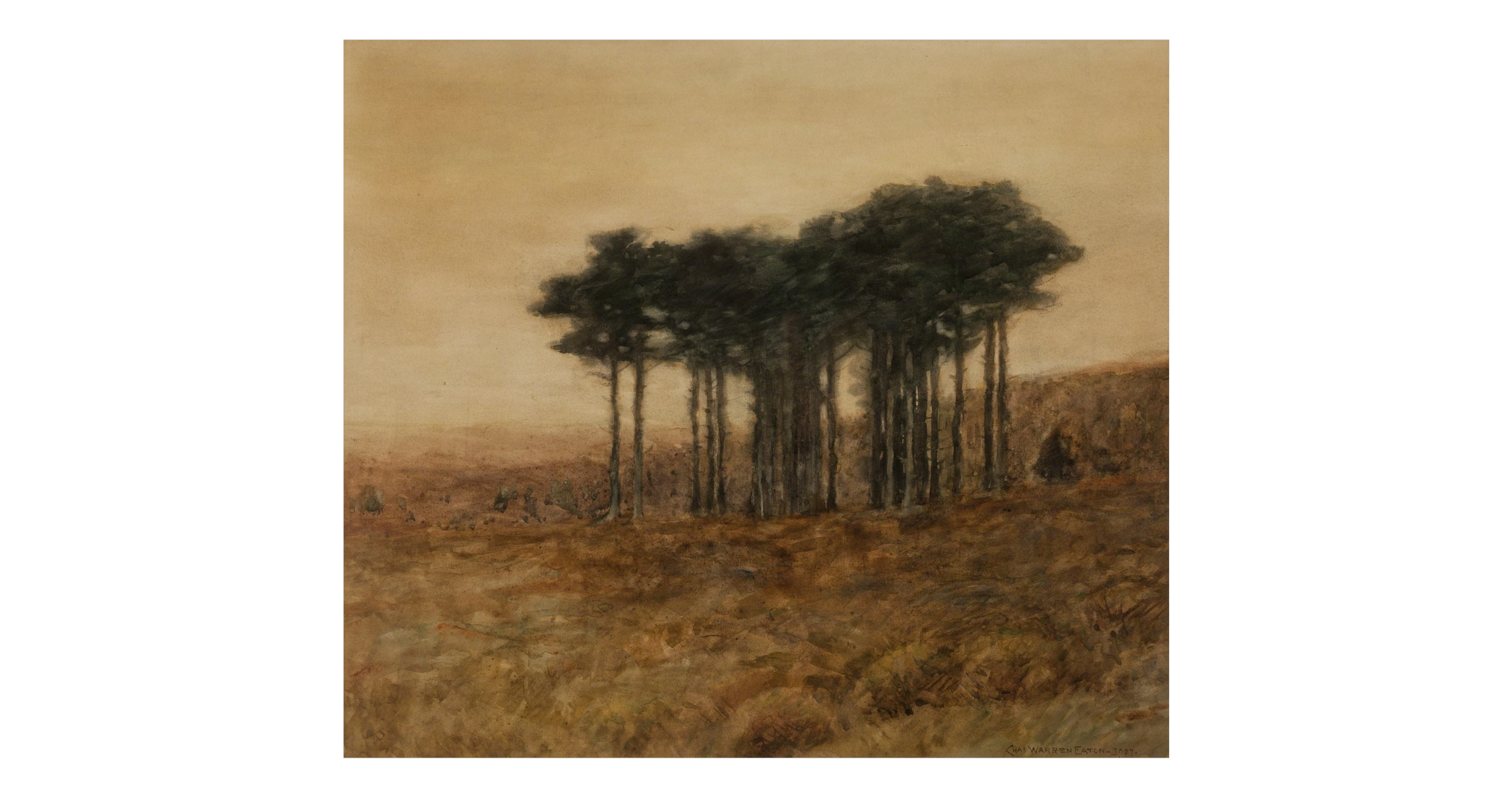
Original Painting by Charles Warren Eaton (quickly becoming my favorite tonalist painter), Gloaning Pines, c. 1910, watercolor
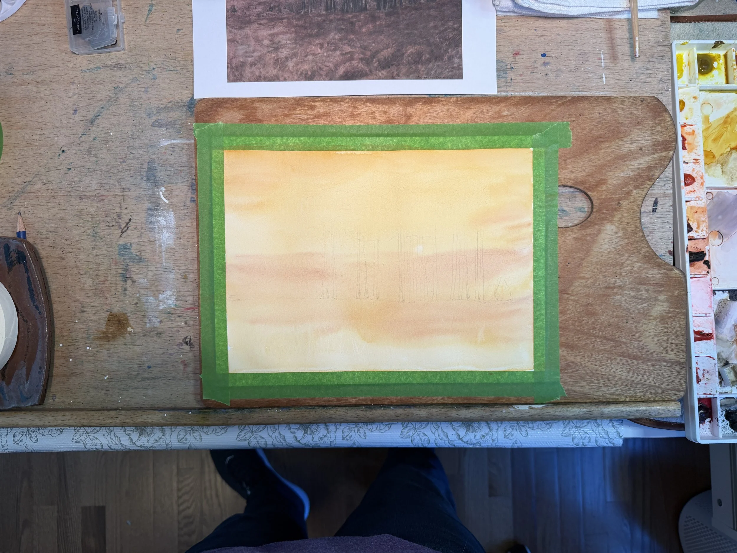
Super simple sketch to start off. My paper is 9×12 Fabriano Artistico which is slightly different w/h ratio than the original of 14×16. So I adjusted things to work. Oh, look. You can see my feet. I first laid down a layer of yellow ochre and burnt sienna over the entire painting and let it dry. I did an awful job documenting each step in photos. Sorry. This is my journey.
To this I first added in the background hill using burnt sienna, van dyke brown, and deep sap green. The painting required a lot of fine mist to be sprayed to keep the water just damp enough to make soft edges. This was probably the most difficult part of the process. I really struggle with water control, even after 5+ years of painting. Winter has bee extraordinarily dry and our summers are very humid so it is a constant battle to get it right.
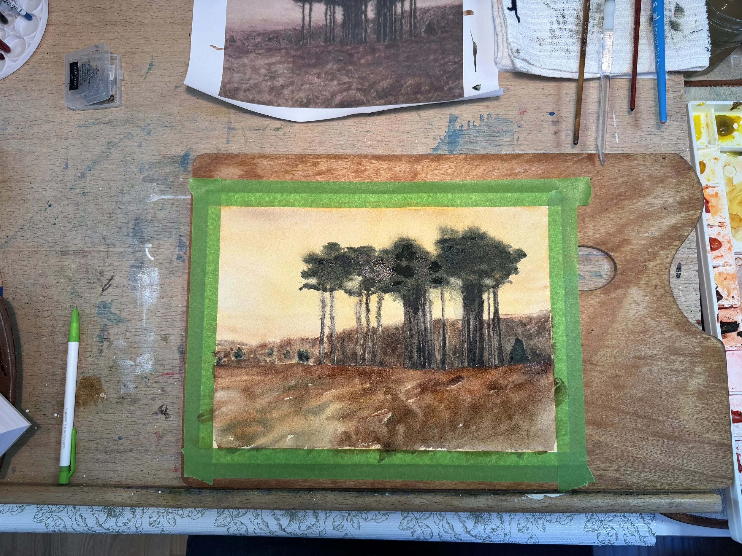
For the tree trunks, I use lunar black and van dyke brown and that spray bottle to achieve the fuzzy trunks and branches. Notice the careful way that the trees are not evenly spaced, some growing tightly together. The foreground…ah, the foreground. I completely made it entirely too dark the first go round. Luckily, my palette is full of liftable watercolors so i was able to wet it down and lift it off using a paper towel. The paper towel actually added some texture. In this phase, I also added the tops of the trees in deep sap green and undersea green with a touch of indian red, and once again utilizing that soft mist sprayer.
Here you can see I have gone back into the tree trunks, lifted some and darkened others to add depth. I also lifted some areas in the background to add depth and variety. For the grasses, I have added transparent yellow, indian yellow, and quin gold using a fan brush. Although the color is much brighter than the color in the original, I have to admit I like it better. Painting using 150 old paintings and relying on the photograph on line or in a book is not necessarily a true representation of the painting and I don’t always count on what I see to be right. Plus, this is MY journey and I get to make choices. (HA!) Looking at the sky, I actually thought it too bright, so I added some brown from my palette to the left upper side on down to the horizon and across the top. I did a little tweaking here and there mostly by lifting color to add texture.
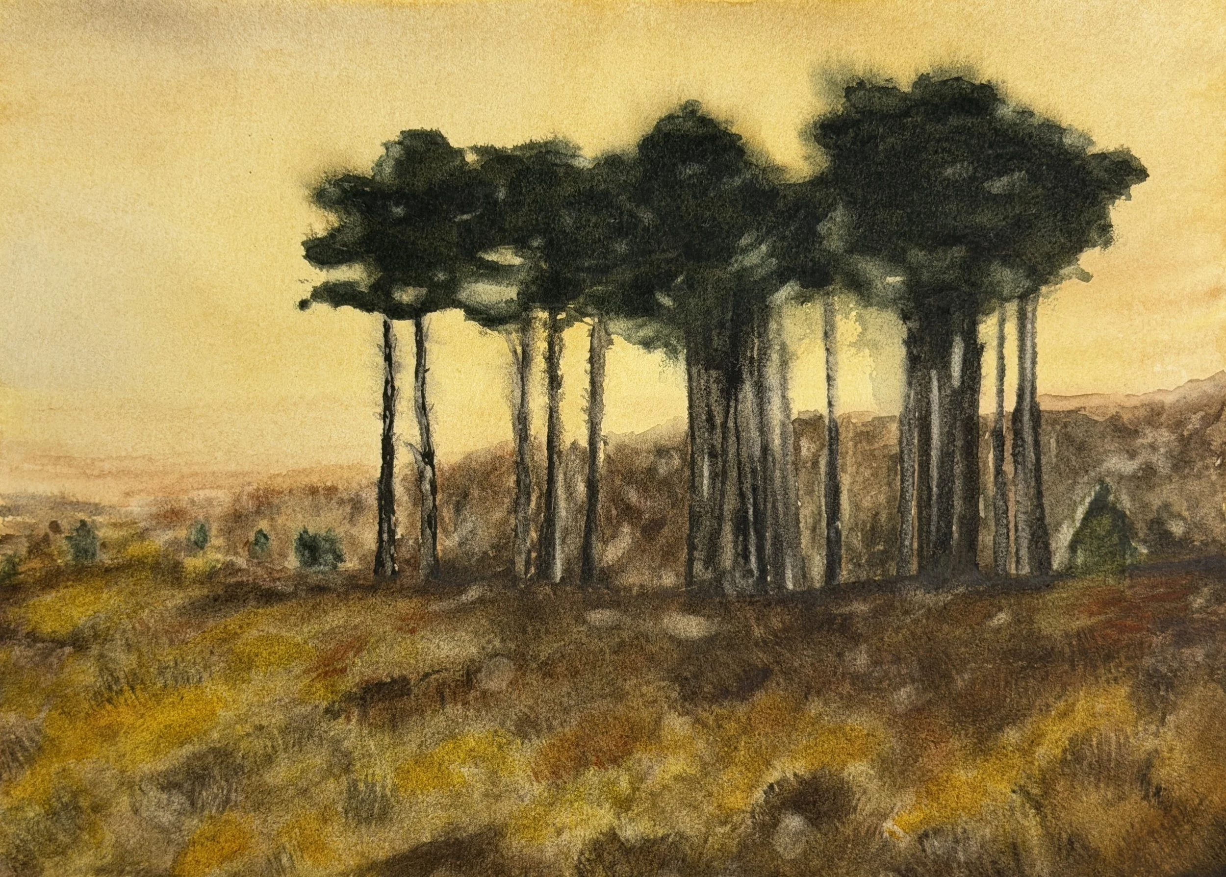
When I began, I literally thought this would be an easy one. It was anything but. I am happy with my final piece but it felt like a mis-step every decision I made. I do absolutely LOVE the simplicity of the trees in this composition and may even hang this on my own wall someday.
Until next time, happy painting!